design

Travel, Food

A Day in Solvang

Solvang, California

Solvang, California

The Landsby

My curiosity in the Landsby was piqued by an article in Travel and Leisure. It's located in Solvang, a unique little town that looks like a Danish village in the middle of California.  I visited many years back but was intrigued by the photos of the addition of the new Scandinavian chic boutique hotel.  My great grandfather was from Copenhagen, and I would love to visit there one day.  Traveling with a toddler is tricky, so for now this is a lot closer!

Dining room at Mad + Vin (food and wine in Danish)

Dining room at Mad + Vin (food and wine in Danish)

Janna Conner Jewelry-10.jpg

Charcuterie plate at Succulent Cafe. Hands down the best charcuterie plate I've ever had. Great selection of meats and loved the picked vegetable garnishes. They also have a great wine list, which is always important! We chose to sit outside on the patio and enjoy the nice weather. It's also conveniently located directly across the street from the Landsby.

A trip to the Santa Ynez Valley wouldn't be complete without a little wine tasting! First stop: Lucas and Llewellyn tasting room. We weren't initially familiar with their wine but decided to check it out while waiting for our room to be ready.  It was conveniently located just a block from our hotel and provided the convenience of trying great, new wines without having to make the trek to individual wineries. We had their white wine tasting, and liked their chardonnay and viognier the best. We bought a few bottles to take home and enjoy later. It's always fun to drink a wine that conjures up a memory of a great trip!

The sunlit lobby facing Mission Drive at the Landsby

The sunlit lobby facing Mission Drive at the Landsby

I love the natural wood and neutral color palette with pops of yellow. I also appreciate the unexpected detail of the tiling on the underside of the stairway.  Santa Monica design firm, Studio Collective did a great job of creating a chic yet relaxed, and understated vibe. The Scandinavian chic look is on trend for decor, because it follows not only form but function as well. It's my style of choice for my downtown LA office and personal residence.

Raf standing with Sherry by Rachel Brown.

Raf standing with Sherry by Rachel Brown.

Tina by Rachel Brown in the Landsby Lobby.

Tina by Rachel Brown in the Landsby Lobby.

One of my favorite design elements of the Landsby are the paintings by Rachel Brown that are in the lobby and in most rooms. She is a Misssouri native, now calling West Los Angeles home. Rachel comes from a long line of artists, both her mother and grandmother are painters and she picked it up at a young age. Growing up on a farm and being a lover of travel and adventure, one can easily see both of these influences on her work. I personally enjoy the whimsical spirit of her paintings. She even teaches workshops in the LA area,  I may have to take one myself!

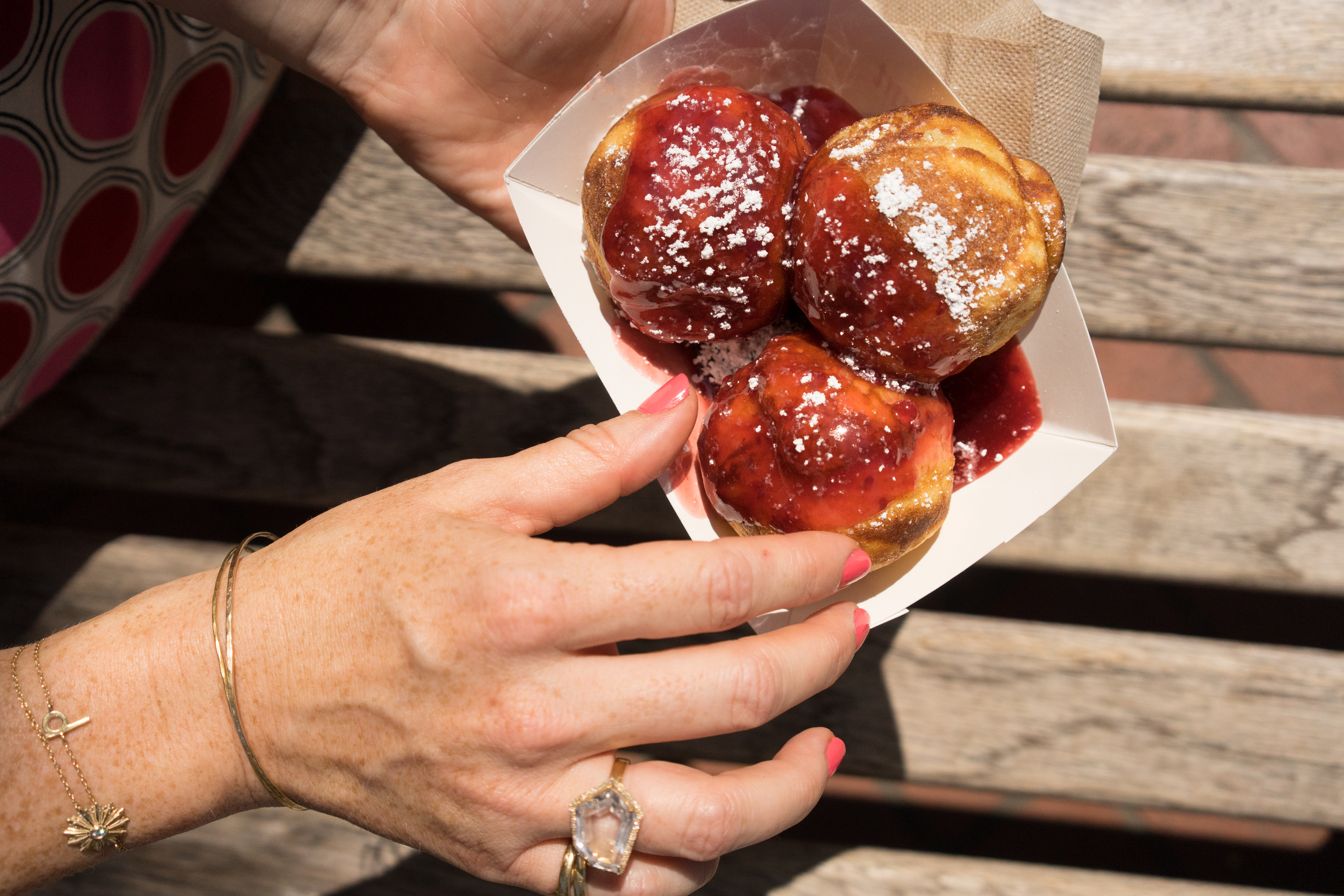
    Aebleskivers at Solvang Restaurant.

    Aebleskivers at Solvang Restaurant.

After lunch we walked over to the Solvang restaurant to try Aebleskivers (jam filled pancakes in ball form) Something you have to try while in town, as it is a quintessentially Danish treat.

We had so many recommendations for food in Santa Ynez but decided for dinner to go with one that was a true favorite of local residents. We heard countless recommendations for Industrial Eats in nearby Buellton, and it did not dissappoint. It's a short drive from Solvang, and as the name attests it's located in an industrial area.   Despite it's spare surroundings, it has an inviting interior with large shared tables and the restaurant and butcher shop features food sourced from the Central Coast. We enjoyed the mussels, oysters, zucchini accented pizza and shrimp & pancetta toast. Delicious! They also offer butchering workshops if you are keen to get your hands dirty and fresh preserves, pâtés, cheese and handmade bacon to go.

Winding down after a fun filled day.  Unpacking, never leave home without my Bottega Veneta travel duffle bag or my Valextra travel jewelry pouch to house all my many jewelry options! Also, shown Janna Conner Dome cuff bangle and Arria Amazonite Beaded Necklace. I spy Sherry peeking out behind me on the wall!

 I recently cut my hair and have been using Sachajuan to enhance natural waves. The Sisley Suprema Yeux eye cream is an indulgence, love the gold packaging and that it's a pump and not a pot so keeps product fresher longer. The Nuxe Huile Prodigieuse oil is great for cuticles, body, face and I even use it on my hair. Love multi functional products since I feel like it makes me a tiny bit faster in my constant struggle against the clock.  Love how my jewelry matches the decor! Shown Janna Conner Evita Crystal Point Necklace, mother of pearl tala ring, and 14k gold ear cuff.

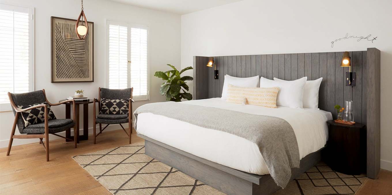
The King bedroom with Patio, love the Goodnight on the wall. Such a sweet touch!

The King bedroom with Patio, love the Goodnight on the wall. Such a sweet touch!

Bottega Veneta sandals, Janna Conner dome cuff & pearl Gilda ring.

Bottega Veneta sandals, Janna Conner dome cuff & pearl Gilda ring.

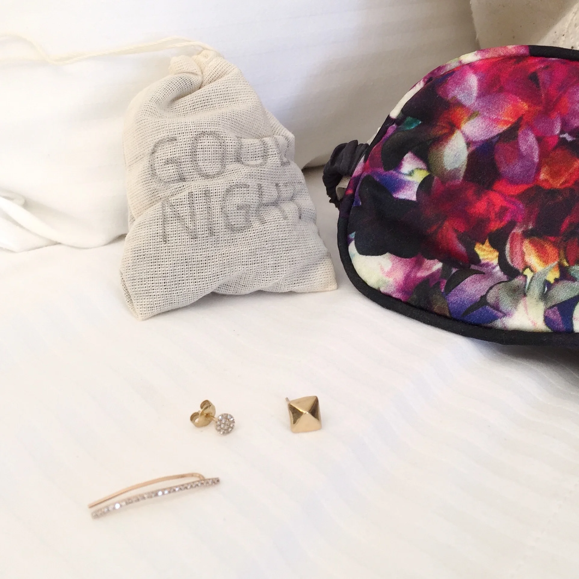
Time for bed! Janna Conner diamond ear crawler, diamond disc, and pyramid stud.

Time for bed! Janna Conner diamond ear crawler, diamond disc, and pyramid stud.

What a fun day of food, wine, design and décor! I know we'll be back soon Till next time!

Los Angeles CA, Art, Food

An afternoon in Downtown Los Angeles

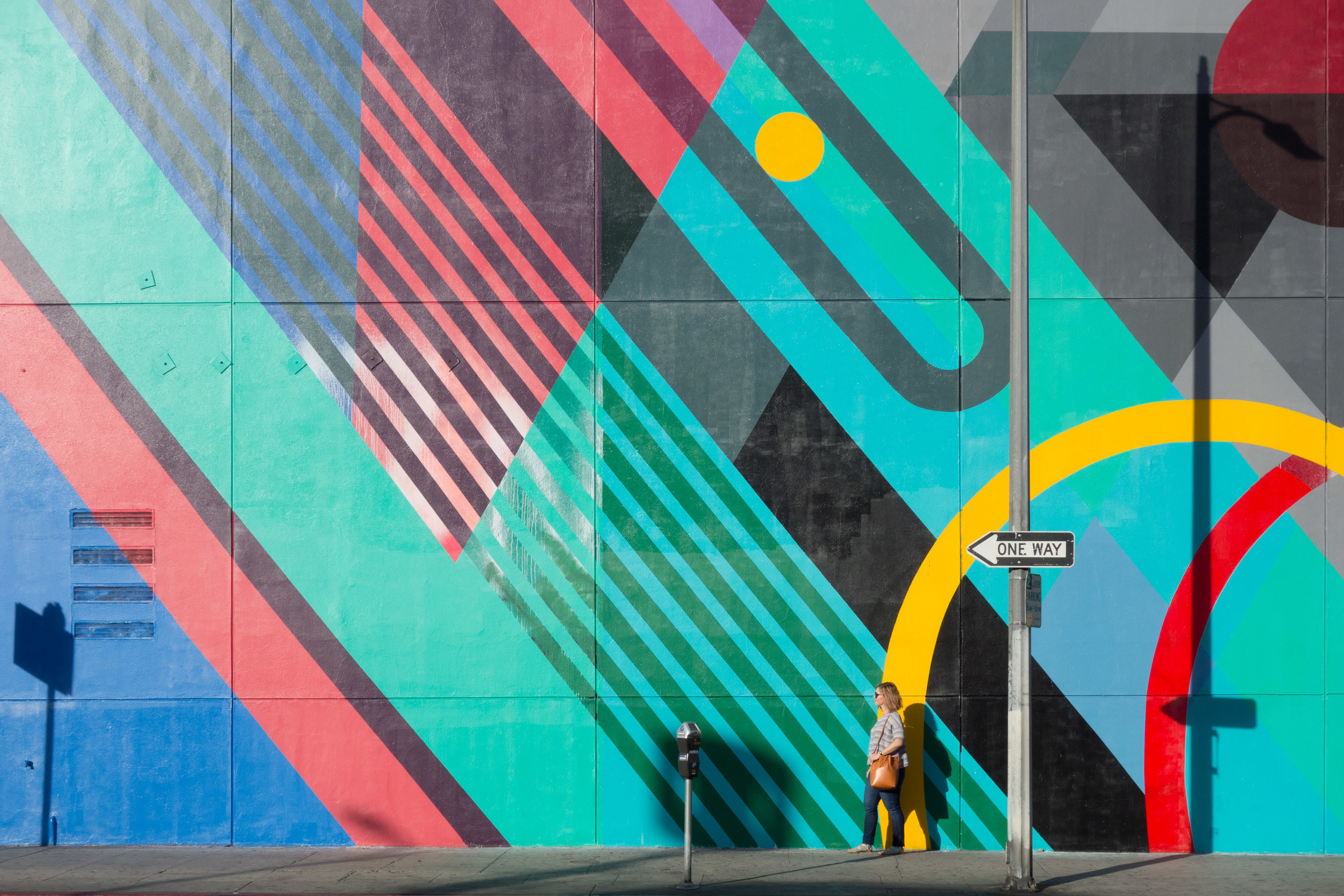
Los Angeles is the mural capital of the world! I love murals and think they are a great way for art to be shown on the streets of any city. Downtown LA especially has a lot of murals and graffiti, I notice new ones popping up all the time. Since they are out in the open, you can really interact with them in a different way than art in a museum. You can get close up and touch it or even take an obligatory selfie. Natural sunlight and shadow change how they look depending on the time of day and how they age with weathering. They are like living pieces interacting within their community. This was created by artist Teddy Kelly whose mantra is to "follow the bliss" which is something we can all try to live by. The bold colors, shapes and the use of line really mesh together to create something beautiful! To think this was tagged over! Thankfully it was recently restored to its original beauty.

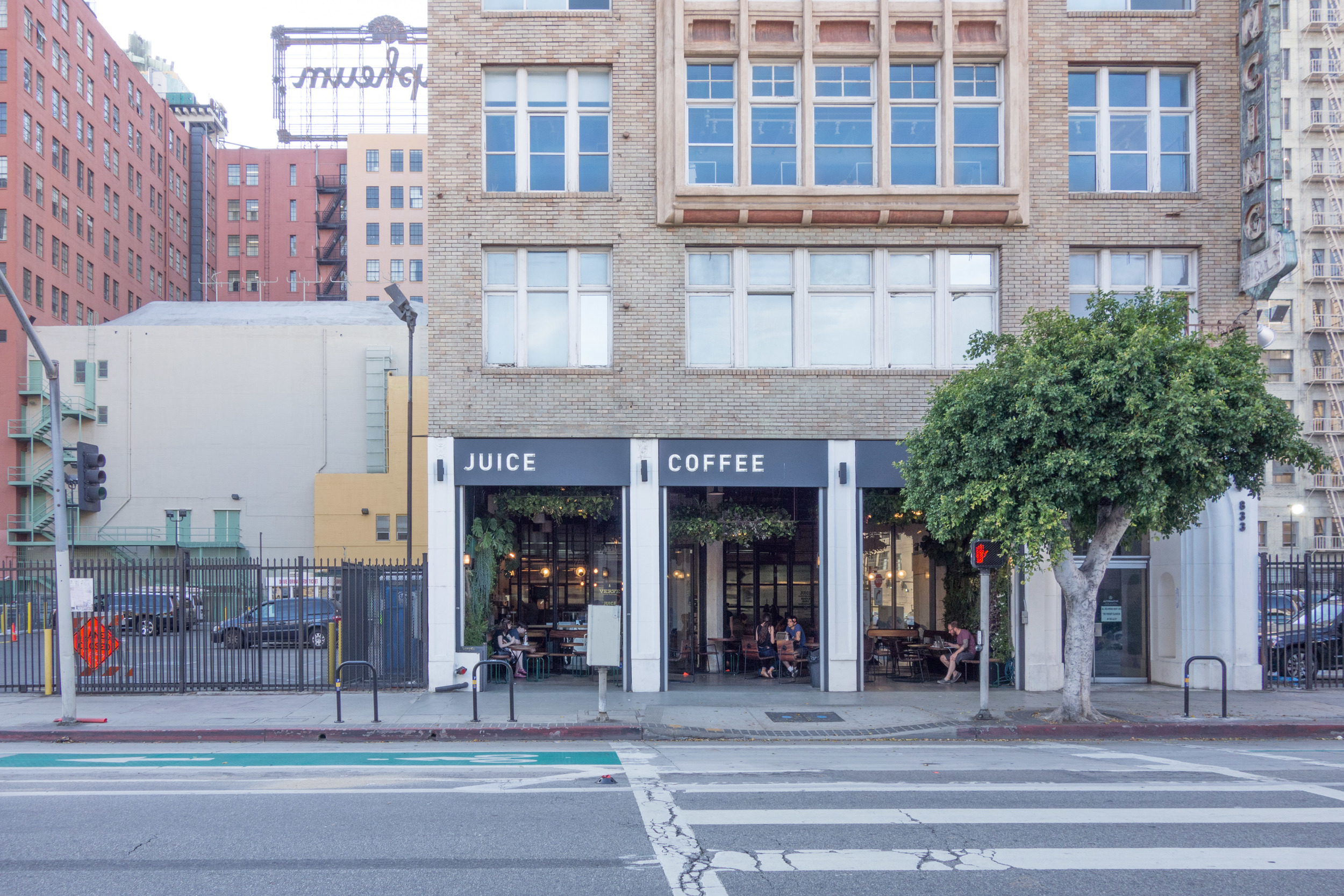
Verve Coffee Roasters off of Spring Street. @vervecoffee

Verve Coffee Roasters off of Spring Street. @vervecoffee

The outdoor space at Verve Coffee Roasters.

The outdoor space at Verve Coffee Roasters.

Next stop: Verve Coffee Roasters for a little afternoon pick me up. I'm a coffee drinker through and through. I have to have it first thing in the morning; my husband can verify I'm a grouch without it! When I'm lagging in the afternoon, its aroma perks me right up. Verve originated in Santa Cruz before making its way to Los Angeles. The goal of their company is to bridge the gap from what they call "Farmlevel to Streetlevel," which provides open communication between growers and consumers. I love a hanging garden, so I especially enjoy their outdoor seating area. Besides being a cool space to hang out, they actually roast their own coffee!

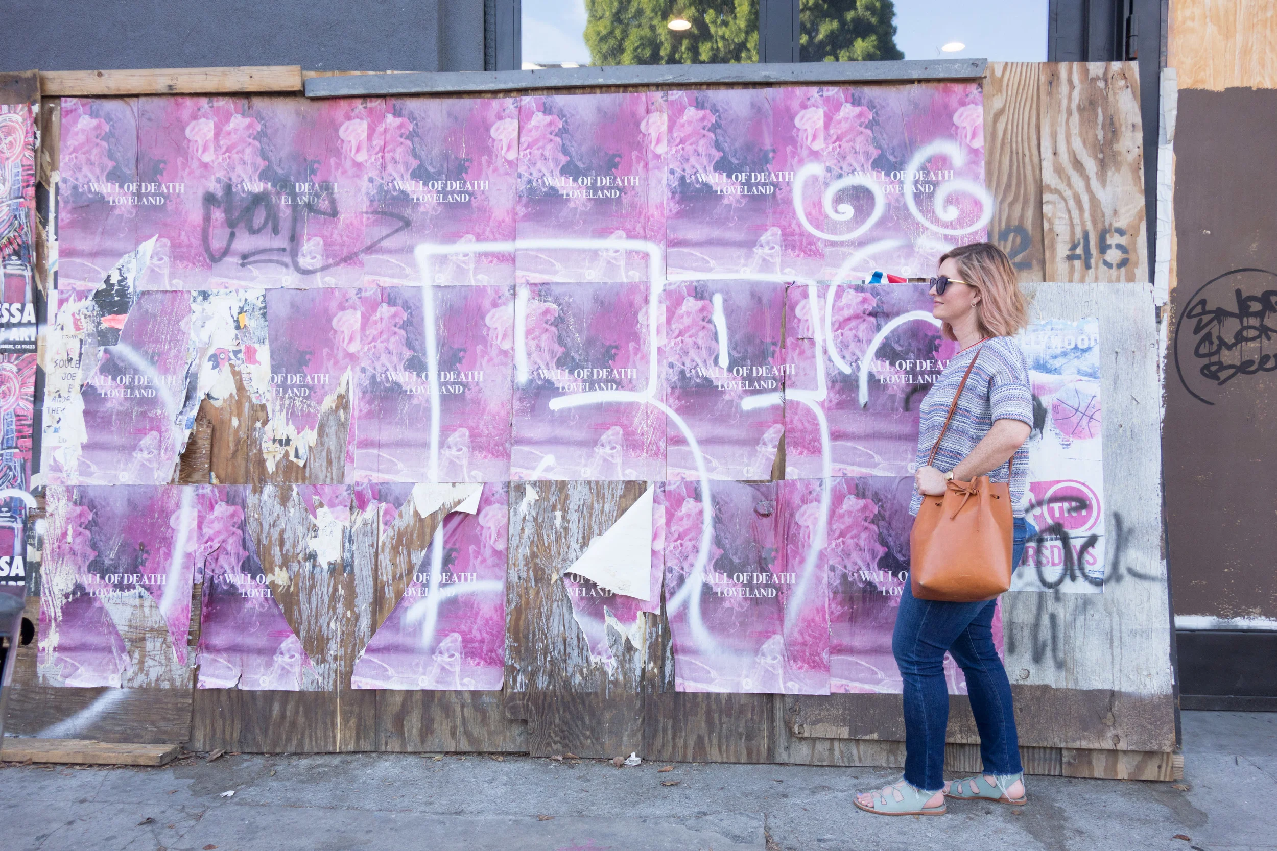
Walking by the French band Wall of Death's album cover.

Walking by the French band Wall of Death's album cover.

I'm not familiar with Wall of Death, but the vibrant colors in the album cover definitely stand out to me. You can watch their video Loveland here.

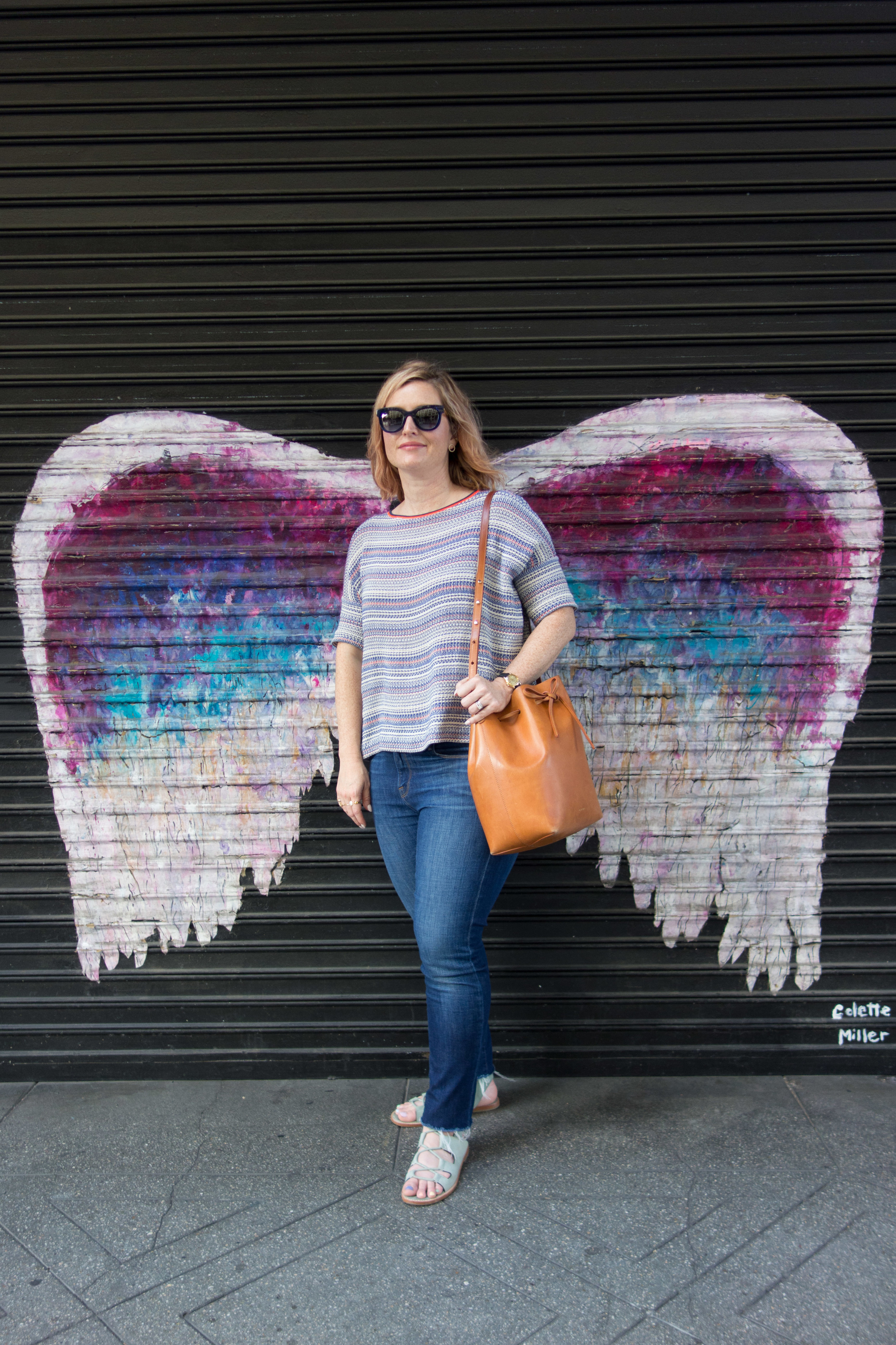
The Wings by Colette Miller.   I'm wearing Thierry Lasry Sunglasses, Frame Denim jeans, Mansur Gavriel bucket bag, Ba&sh top

The Wings by Colette Miller.   I'm wearing Thierry Lasry Sunglasses, Frame Denim jeans, Mansur Gavriel bucket bag, Ba&sh top

Colette Miller created the Global Angel Wings Project in 2012 to "remind humanity that we are the Angels of this Earth."  She started painting her wings in downtown Los Angeles and has branched out to other parts of the world. This particular one was painted in 2013. I love the way the paint is cracking and beginning to show signs of age, giving it even more character. Miller has painted wings in locations including Africa, Australia, Turkey and Cuba. She even gave a TEDx talk to discuss how her Global Angel Wings Project expanded into a social phenomenon. Visit her website for more information.

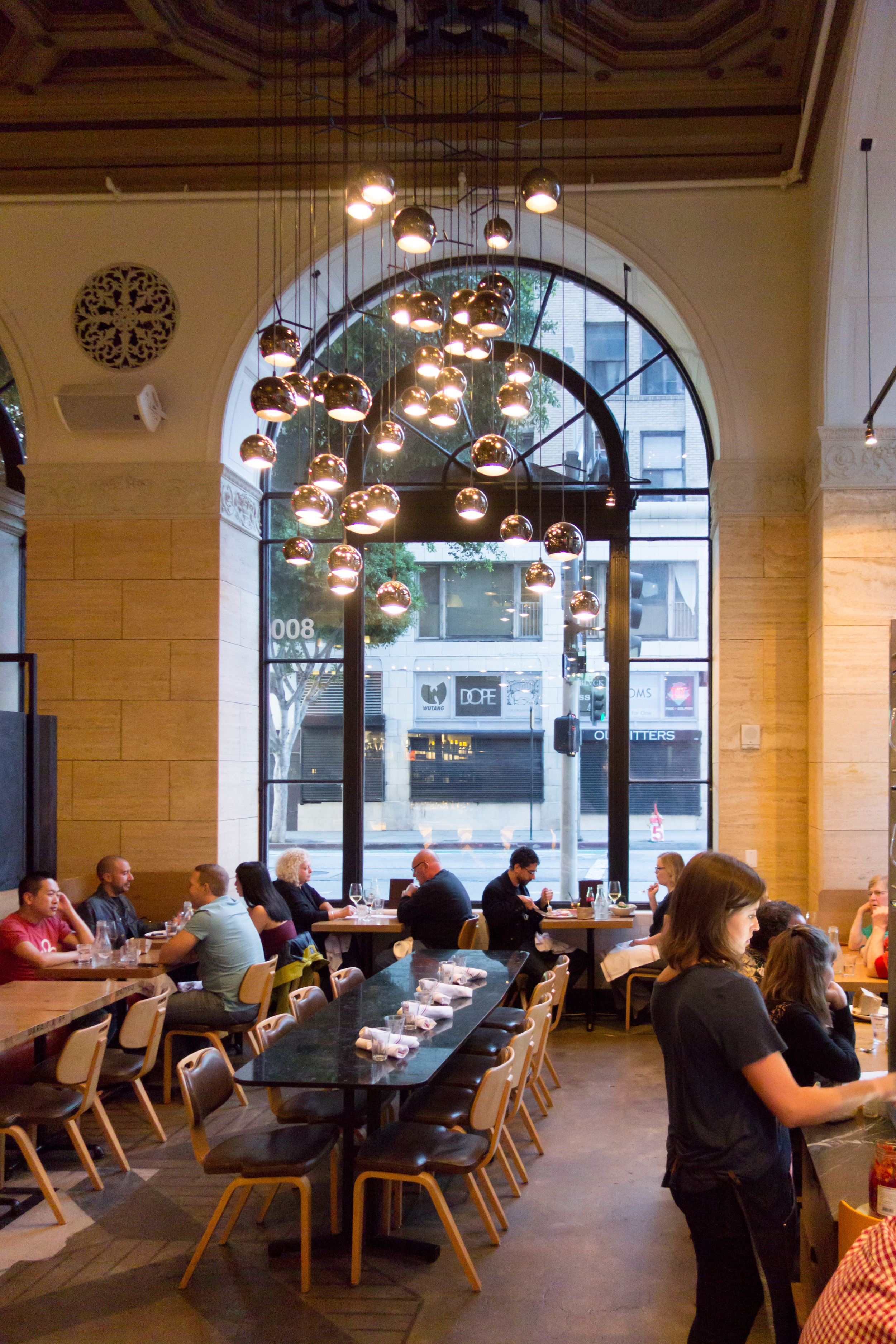
One of three distinct lighting sculptures; this one really caught my eye. Love the massive arched windows!

One of three distinct lighting sculptures; this one really caught my eye. Love the massive arched windows!

Waiting for my food!

Waiting for my food!

The kitchen staging area. Love the chevron design in the wood!

The kitchen staging area. Love the chevron design in the wood!

Terroni was originally founded in Toronto, Canada, and Los Angeles houses their only American locations. The space was first used as the National City Bank in 1924 in the Historic Core District before becoming the restaurant in 2013. The building is actually 6,ooo square feet, which is huge! It was designed by Giannone Petricone Associates. They definitely embraced a more is more philosophy when building the space. There's a lot going on; chevron marble and wood cutouts, curvilinear chandeliers, varying furniture from table to table but somehow it just works. I especially love the white marble used throughout the restaurant and under the bar, cut and adhered in a chevron pattern. The play of light and shadow make the marble look like alternating bands of black and white. Same with the wood under the kitchen staging area, pictured above. It is a very contemporary Italian space full of wit and whimsy. Everything on the menu is so delicious, you can't go wrong. On this particular visit, I ordered the special which was duck ragu' pappardelle, quattro stagioni pizza, and the ricchia salad. Delish!