The Broad Museum - Downtown Los Angeles
Detail of the honeycomb lattice exterior.
The newest addition to the burgeoning LA art scene is the Broad Museum. It truly is an impressive site to behold! I love passing by it and Disney Hall every day on my commute. It's such a welcome addition to the neighborhood. It's across from MOCA, now making it a mini museum row of two impressive collections. The Broad was designed by Diller Scofidio + Renfro in collaboration with Gensler, it's a 120,000 square feet example of the "veil and vault' concept. Home to almost 2,000 works of art, there are two stories of gallery space combining public exhibition space with collection storage. The vault which houses the art storage defines the user experience throughout the museum. It's heavy mass is visible from underneath on the ground floor and on the top level when you are walking on it.
Arriving at The Broad, going up the elevator through the vault to the top level..
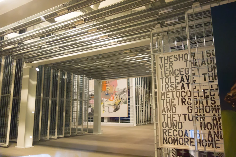
John Baldessari - Tips for Artists Who Want To Sell, 1966-68
Getting tips to make some money!
Jeff Koons - Tulips, 1999-2004. Background: Christopher Wool - Untitled, 1990
I never thought I was that much of a Jeff Koons fan but there are several works of his on display at the Broad. He's apparently one of their favorite artists to collect. The way the Tulips are displayed is pretty incredible. Light floods in from every angle from the honeycomb "veil" which forms the ceiling. On a sunny day, (of which there are no shortage of in LA) it's breathtaking. With all the light, the colors are brighter, and the reflections of the metal really standout. There is another Koons Tulips, at the Wynn hotel in Las Vegas. See here what a difference light can make! Behind the Tulips, is a work by Christoper Wool, an artist I wasn't that familiar with but have since come to enjoy. i love how the two works of art complement each other in the space.
Julie Mehretu - Cairo,2013
Just on the side of the Tulips is another giant piece by Julie Mehretu. Her painting juxtaposes precise technical architectural drawing with the chaos of a windstorm blowing through the city of Cairo. It's a subtle yet impactful piece. I love the little pops of neon color peppered throughout the delicate drawings. Mehretu, born in Ethiopia, is one of the many female and various ethnicities represented throughout the Broad. I appreciate the cultural diversity of its collection. Touring through the space I felt that they tried and succeeded in the effort to represent male and female artists from all over the world. Sure, there are the usual who's who of contemporary art like Koons, Hirst, Burden but there is also Kara Walker, Yayoi Kusama, Glenn Ligon, and Barbara Kruger to name a few.
The Vault
If you take the elevator down from the top level, you will miss one of the most interesting parts of the Broad. The vault, where they store all of the art that is either not in use or on loan, can be seen from the small stairway that leads down to the ground floor. The Broad Art Foundation purchases fifty works of art annually, that's almost one a week! With all that art, not all can be on display at once so they have to rotate. This is the case in most museums just you never get to see behind the curtain into how or where they store all the unused artwork. The viewing windows are a clever addition to the building, offering this permanent behind the scenes view.
Yayoi Kusama - Infinity Mirrored Room - The Souls of Millions of Light Years Away, 2013
A trip to the Broad would not be complete without a visit to the Infinity Mirrored Room. The wait can run hours long for the room, an experience that only lasts approximately three minutes. My recommendation is to sign up on the queue immediately upon entering the museum. The day I went the wait was two hours but I went and toured the museum and had lunch and by the time I was done, I received my text to line up. At that point, I only had to wait 10 minutes in line. Once allowed in, the room is quite small with a central bridge that juts out over water. There are hanging lights everywhere and they are reflected on the mirrors surrounding you. Unlike with LACMA's Rain Room (which is awesome by the way) you get to enter with only your party so you can take photos with abandon and not have random people in your shot. Something I wished they did a better job of at the Rain Room but that's another story...
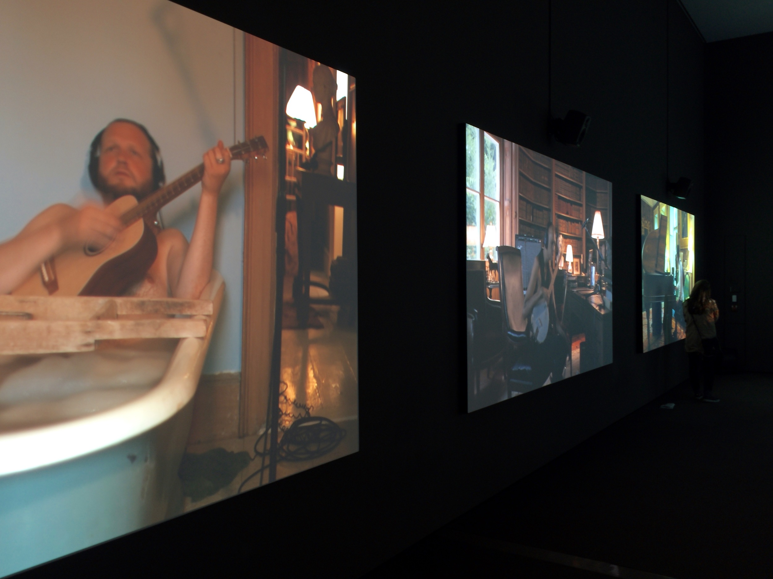
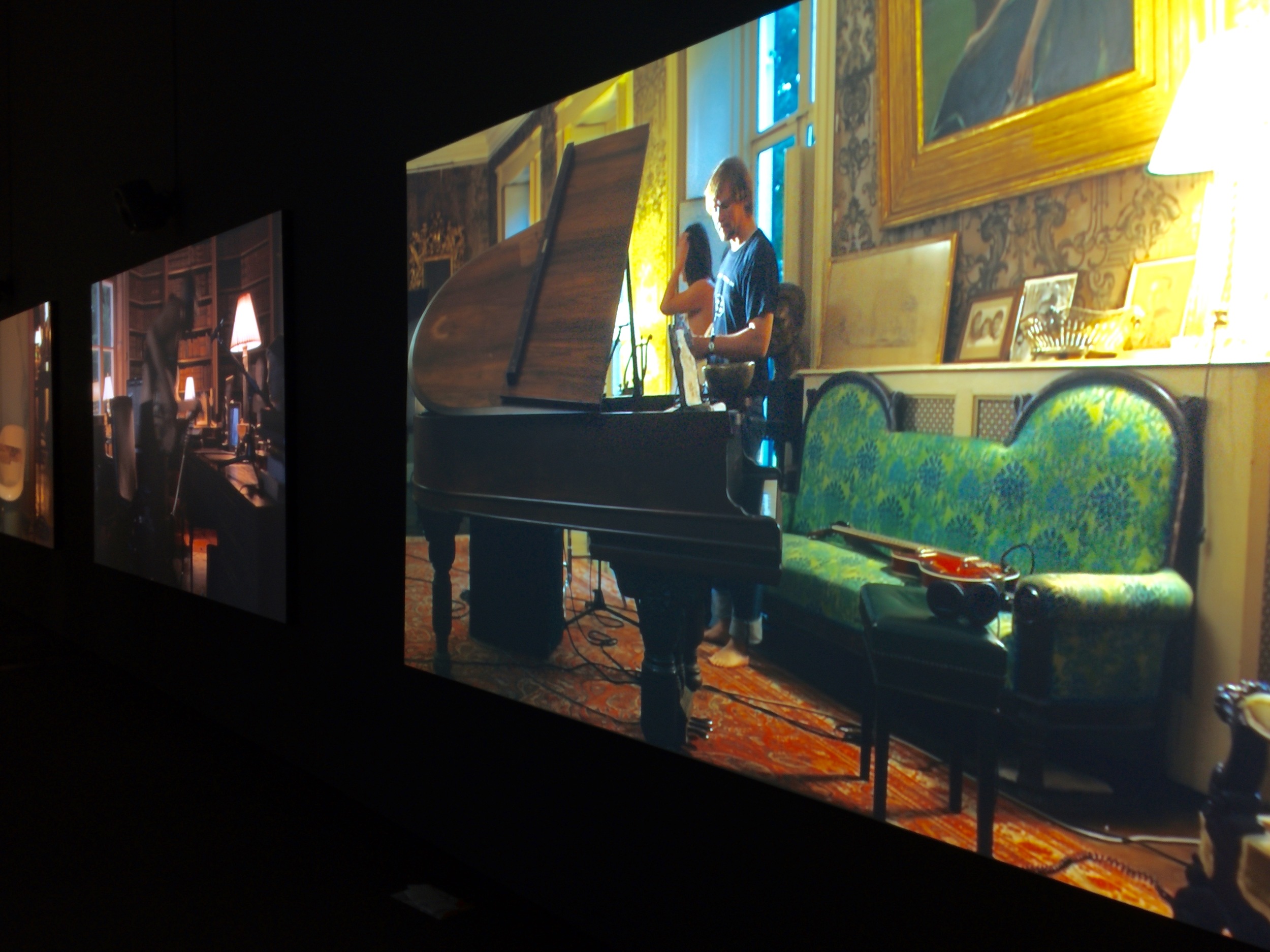
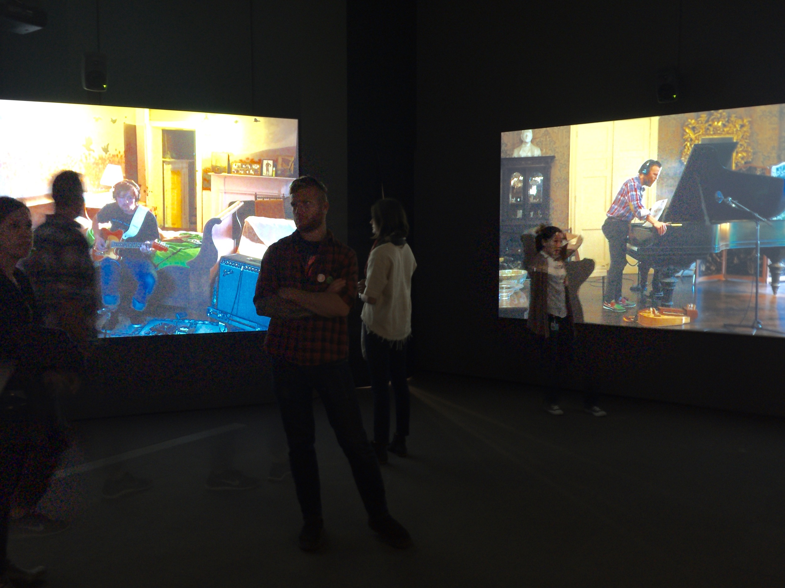
Ragnar Kjartansson - The Visitors 2012
One of my very favorite pieces at the Broad is The Visitors by Icelandic artist Ragnar Kjartansson. It's an hour long video shot featuring nine musicians playing the same song in several rooms of a decrepit house in upstate New York. The viewer is omnipresent, being able to view the musicians walk from one room to the next, and engage with each other or remain solitary in their chosen room. Kjartansson himself plays the guitar in a bathtub throughout the piece. The musicians are playing the same piece of music over and over for the entire hour. What seems like would become maddeningly repetitive, is actually quite beautiful. The Visitors explores how the same lyrics performed by different musicians transform from poignant to transcendent. I've seen this piece on several visits to the museum, and since it is an hour long, it's understandable that it can be challenging to see the entire piece from start to finish. I've noticed that for people to really get it, it's helpful to see it from the beginning to see them setup in each room, interact with each other and then check back in at the end when they unplug and all leave the house together. Hurry and go see this piece before it and other pieces from the inaugural collection are taken down Sunday, May 1. In order to prepare for a special exhibit with Cindy Sherman, opening June 12, The Visitors and other pieces on the ground floor innaugural collection will be taken down. Hurry up and go already!
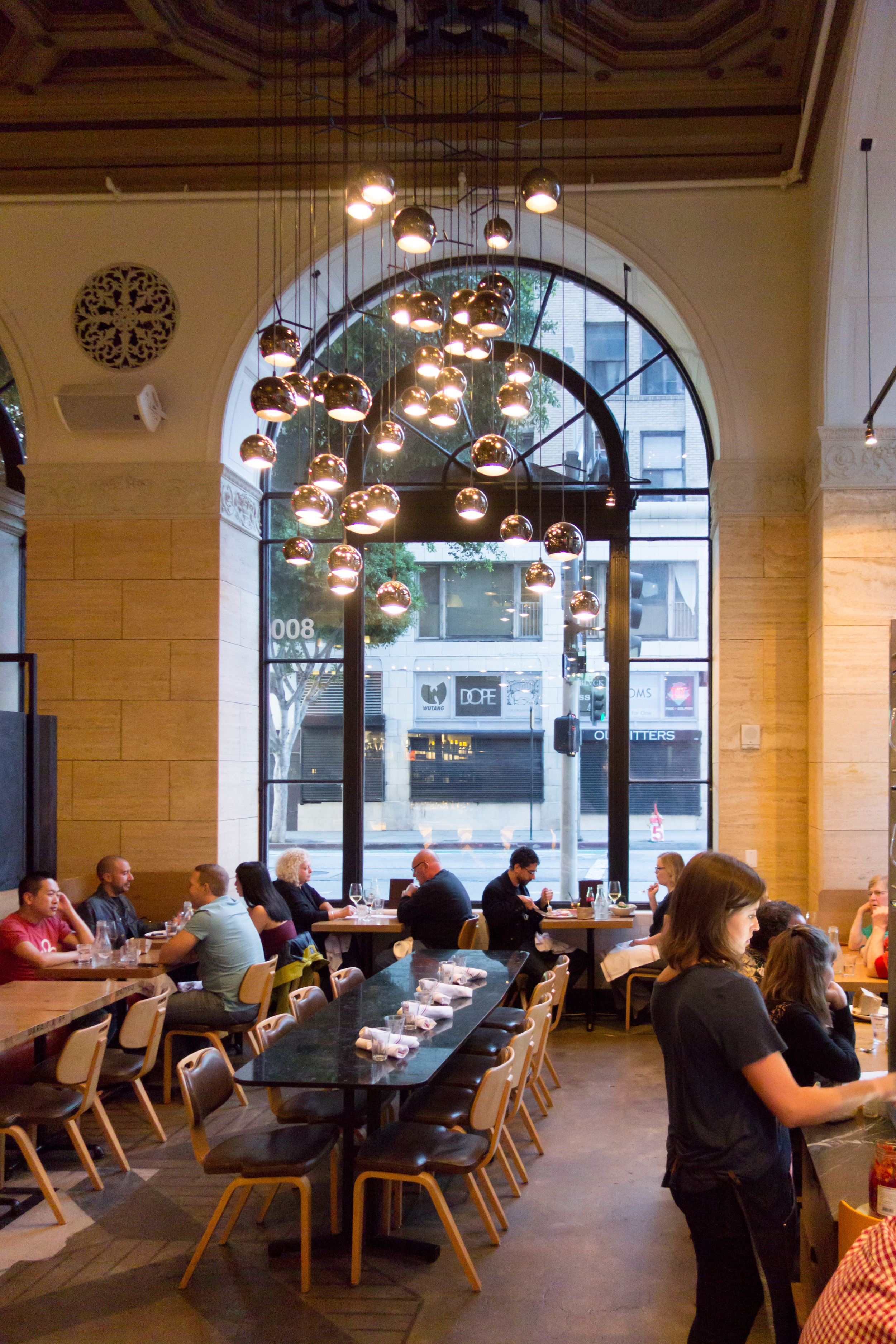
The bar. Interior shot by Otium.
You might be hungry after seeing all those amazing works of art. You're in luck, because Otium, the new restaurant from French Laundry alum Timothy Hollingsworth and restaurateur Bill Chait ( of Bestia, Petty Cash, République and Sotto) is now open. Hollingsworth, only 36, is a James Beard Rising Star Chef of the year recipient. A recent downtown Angeleno transplant, he describes his cuisine at Otium as "sophisticated rusticity with approachable elegance". Otium makes the most of local talent with the vertical gardens that it cooks with by LA Urban Farms, furniture by LA furniture designer Chris Earl, staff aprons by Hedley & Bennett, outdoor design by South Pasadena's House of Honey, and ceramics by Heath and Irving Place Studio.
Stefan Sagmeister - Inside Out and Outside in. photo by Cassia C. Borges.
I love this hand painted wall of thicket of branches spelling "Inside Out and Outside In" by Stefan Sagmeister. He's an Austrian born, New York based graphic designer and typographer, renowned for album covers for Lou Reed, David Byrne and the Rolling Stones.
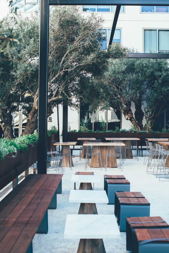
Courtyard by House of Honey
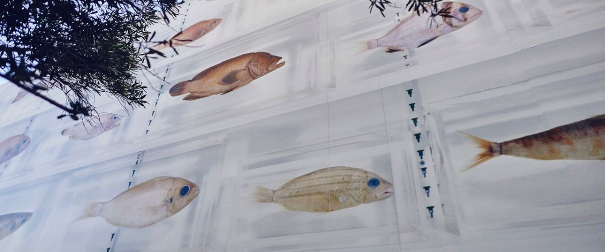
Damien Hirst Isolated Elements. Large scale photographic mural on the exterior wall of Otium.


