dtla

Beauty

Pink Hair Don't Care

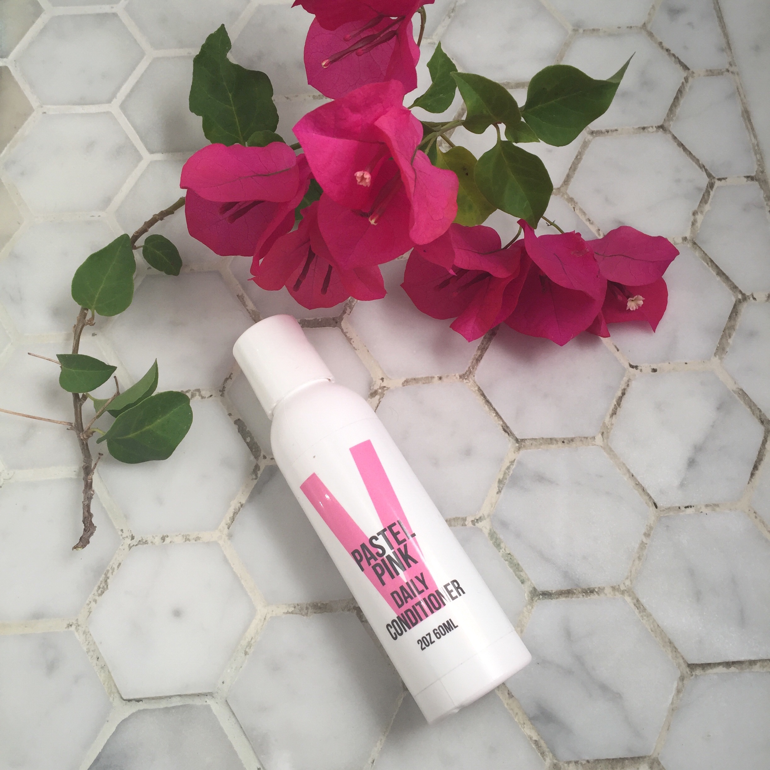
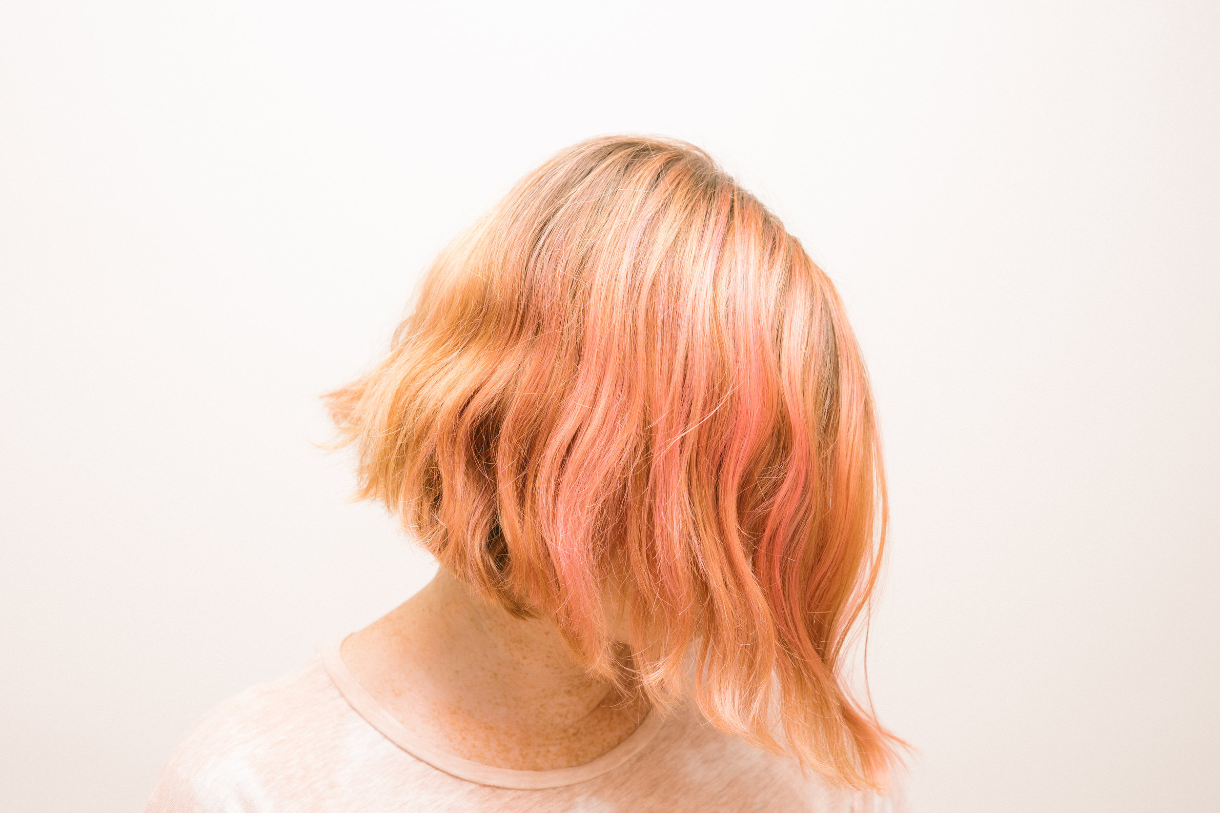
Pastel pink hair using Overtone

Pastel pink hair using Overtone

Brown, Blonde, Blackish, Red, Orange, Pink I've always played with my hair color.  It started in high school when my friend and I were experimenting with a home kit in her bathroom. She had decided I would look good as a coppery red head so we tried it out and this started my love affair with changing my hair.

Coloring your hair color can be drying and damaging so I always make sure to use sulfate free products, wash infrequently, use dry shampoo and apply dry oil as a leave in treatment, and use a deep conditioner weekly.  I was thrilled when I found Overtone, a color depositing conditioner that can enhance your color without damaging it. It's the ultimate fun, no commitment hair color. Since it's conditioner, it's hydrating and won't ruin your hair. Plus,  it's vegan and sulfate free so what are you waiting for?!

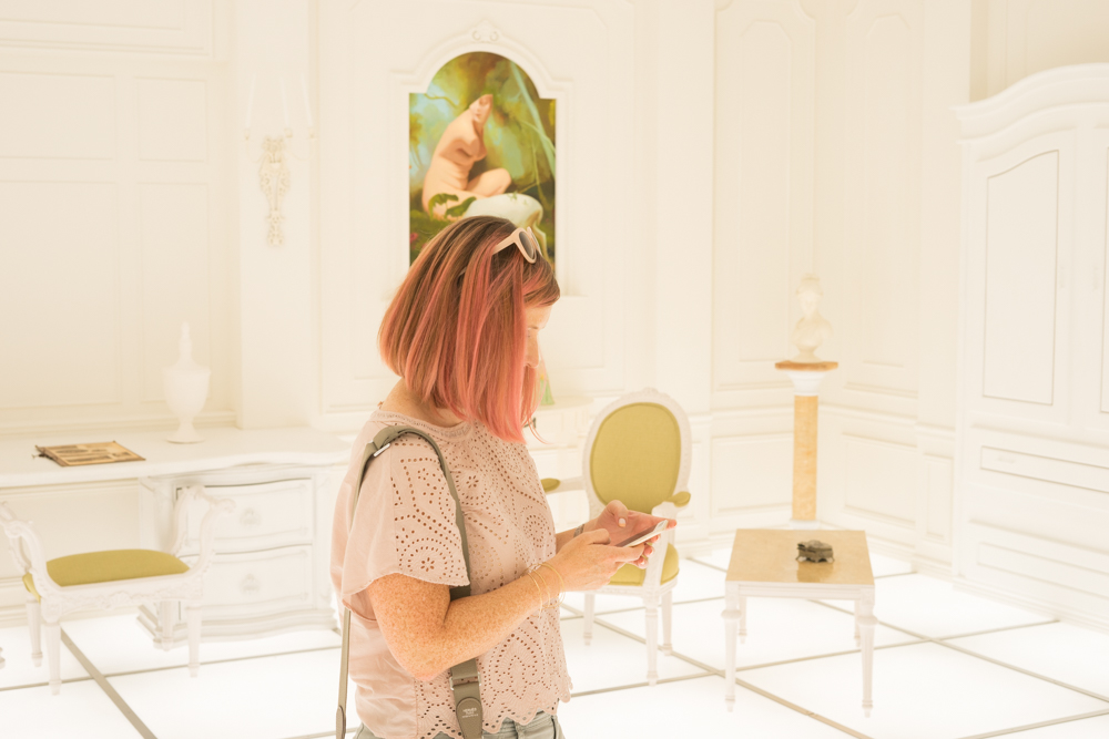
I'm naturally strawberry blonde, although my hair has naturally darkened with age.  I've been using the pastel pink and vibrant pink for a few years now as it enhances the strawberry tones and is flattering with my skin tone. Since I'm so pale and freckled, I find that tones that aren't too overpowering while not being so pale that they wash me out are best.  With the ginger tones in my hair the pink turns rose gold on me. Rose gold and pastel pinks are universally flattering as they warm up any complexion. I've never received as many complements as I do when I have pink hair. People are always puzzled when I tell them it's color conditioner and easy to diy so I wanted to share my hair color secrets here. This is not a paid post btw, I just want to support a fellow female run business and a product I believe in.

I use a hair color application brush, you can get them cheap on Amazon here. I find that it helps give better control over where the color goes and makes for a more even result. I also like to do it on the lightest part first and often not on my roots at all because it makes the color there darker. I've used it in the shower but then missed sections and I'm too much of a perfectionist for that. I wash my hands immediately but you can wear gloves. I'm a little too lazy for that but would definitely recommend if you are using the extreme color or darker shades.

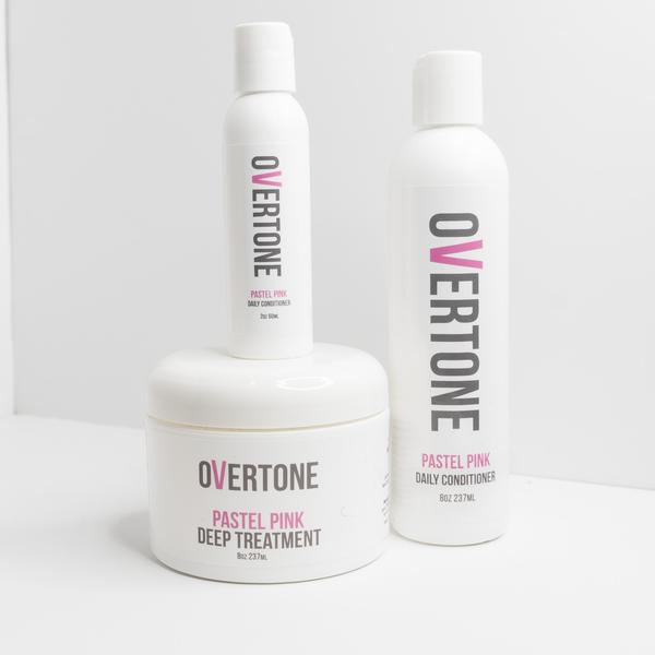
Overtone sells three levels of pigmented conditioner: pastel, vibrant and extreme with daily conditioners or weekly deep conditioners. Daily versions have less pigment than weekly. I use mine every few weeks and then let it wash out so that i can enjoy the different colors as it washes and fades out. They have so many fun colors, teal, lavender, silver, peach, rose gold. With 24 colors in all, the sky's the limit.

Photo Aug 08, 8 41 13 AM.jpg
PASTEL_PINK_d43fd9c4-3e51-436c-84b0-329d4277ffdb_grande.jpg

There's one caveat, it will show up better on bleached hair. I get my hair balayaged a few times a year and then paint on the conditioner onto my highlighted hair. I then let it sit for various times depending on the intensity of color I want to achieve, up to 30 minutes or so and then wash it out and occasionally shampoo and then air dry. Overtone helps to make it fool proof by showing a color swatch of how the various colors turn out on lighter to darker hair.

Janna Conner Jewelry (8 of 18).jpg


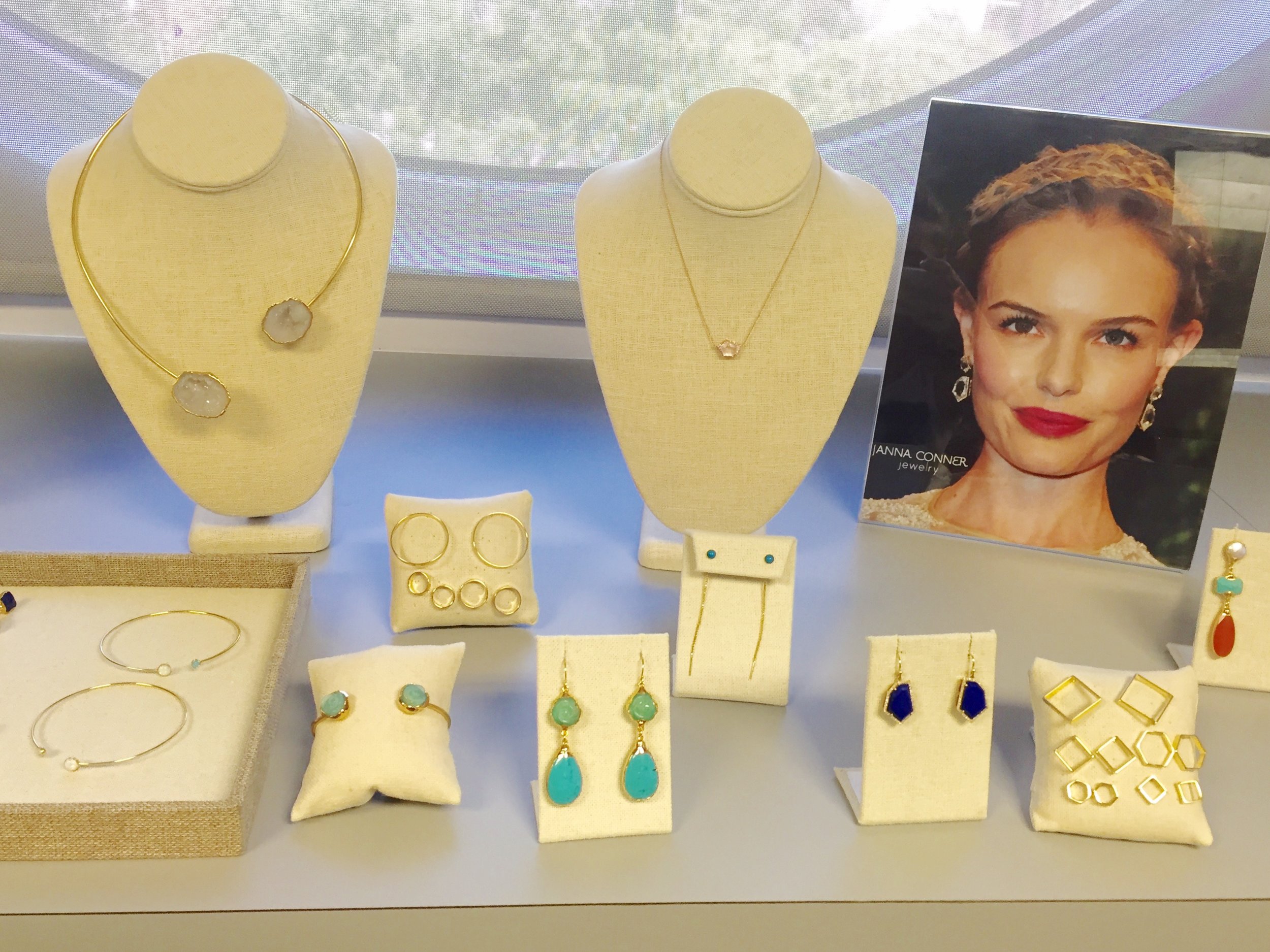
I like to wear bold statement earrings with my pink hair. Gold brings out the warmth in the color and silvers and grays pair nicely as well. You would be surprised just how versatile pink hair can be!

Shown: Janna Conner Evelina earrings

Try it yourself! I'm giving one Overtone Pastel Pink Complete Set of : Daily Conditioner, Deep Treatment and travel size conditioner. Enter on my Instagram @jannaconner to win!

Art, Los Angeles CA, Travel

14th Factory Tour: 10 reasons you need to go now!

I had seen a lot of images of 14th Factory popping up on my Instagram feed when it opened in Spring. For one reason or another, I wasn't able to make it until earlier this month. Since it was late in its run, I wondered if it would be worth it or if it was another Museum of Ice Cream type of expensive selfie photo op. I decided to go and I'm so glad I did. It's closing at the end of July, so make your way there as soon as you can!
The outside of the factory is painted black with giant Chinese characters and black and white flags hanging outside the entrance, imparting the foreboding feel of a pirate ship. (I have a 5 year old son, so we see Pirates everywhere these days) I love that it's in Lincoln Heights, a peaceful, industrial neighborhood I often drive through on my way home. Once inside, there are 14 rooms showcasing mainly Simon Birch's work, the British born, Hong Kong based artist who is the founder/creator of the 14th factory. I spent my Junior year abroad in Hong Kong, and haven't been back since so was excited to see this little bit of Hong Kong brought to LA.

Los Angeles was not the first city envisioned to be the home of 14th factory. 5 other cities were previously in the works, the most recent, New York City, but with all other cities, the project was about to open to the public and they either lost their funding, permitting etc, so this installation has been years in the making and very much a labor of love. Supposedly two of the pieces in the factory were sold to LACMA, so it seems that there really was a happy ending after all.

The site selected for 14th factory LA is huge; 3 acres in total in a former warehouse, making it the largest experiential art project in LA. When I visited, they were in the process of filming a documentary for the BBC, and hoping to have the next site take place in London. This whole project is like a rotating mini museum that is entirely funded by ticket sales and donations. There is no guided tour as you walk through the space, and because of its size it can be a little confusing and overwhelming at times. Birch's intention was that it be an informal space for viewing art in a casual setting rather than the conventional museum going experience. He often gives talks on site and has other collaborative, interactive events with artists on the weekends.

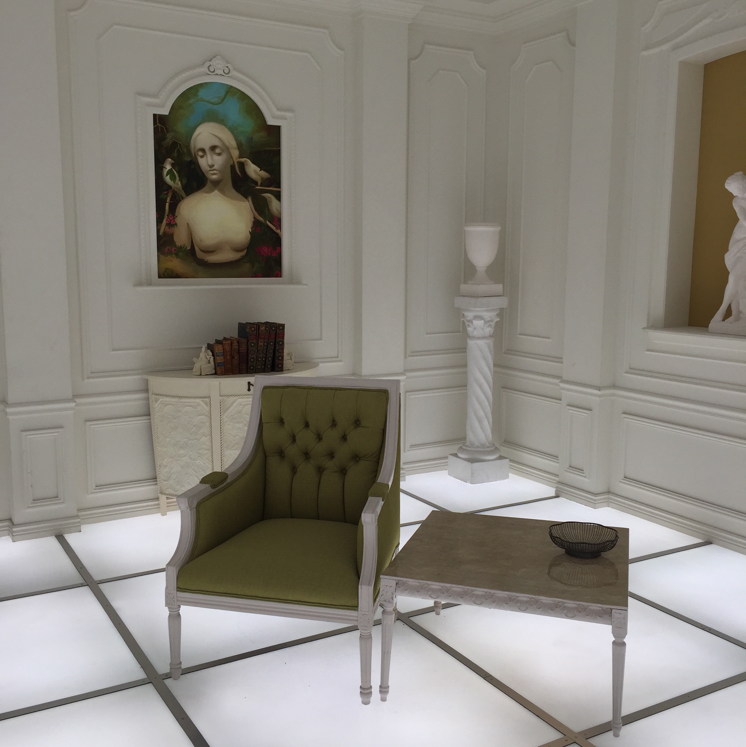
What was the most famous room in the factory (that is until the crown room selfie fiasco) is a replica of the room from the last scene in Stanley Kubrick's 2001. The light up floor emanates a lot of heat, each group of 4 or so has 2 minute to walk through, without shoes on and experience it. It's gimmicky for sure but still pretty cool to experience.

The Barmecide Feast by Simon Birch and KplusK associates

Garlands by Simon Birch, Lily Kwong and KplusK associates.

Garlands by Simon Birch, Lily Kwong and KplusK associates.

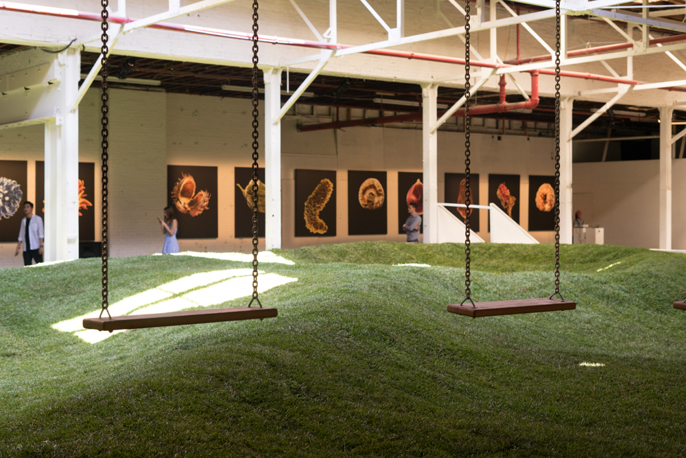
Next up is an interior courtyard, filled with grass. They had just replaced it the evening before. Even though the ceiling is perforated, with the extreme heat of LA summers, the grass just couldn't survive very long. There were a few swings scattered throughout but we were told not to step on the grass because it had just been put down. With nobody on the grass it seemed like a haunted idyllic playground.

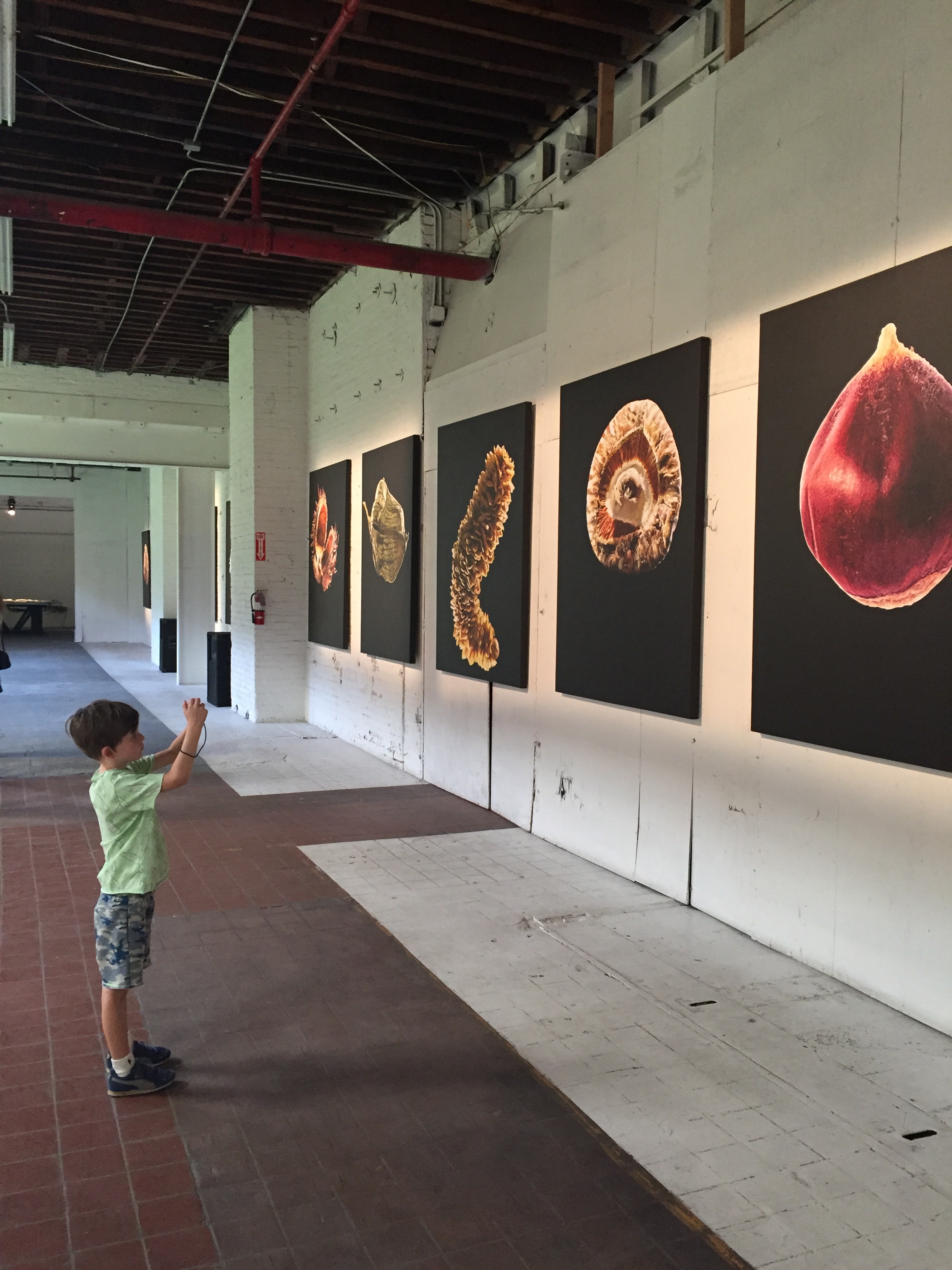
In the Garlands hall there are 10 photographs by Li Wei with various people suspended in mid air. They were shot with the subjects on cranes and in some you can see the expression of the crowd as they look at the people flying in front of them.

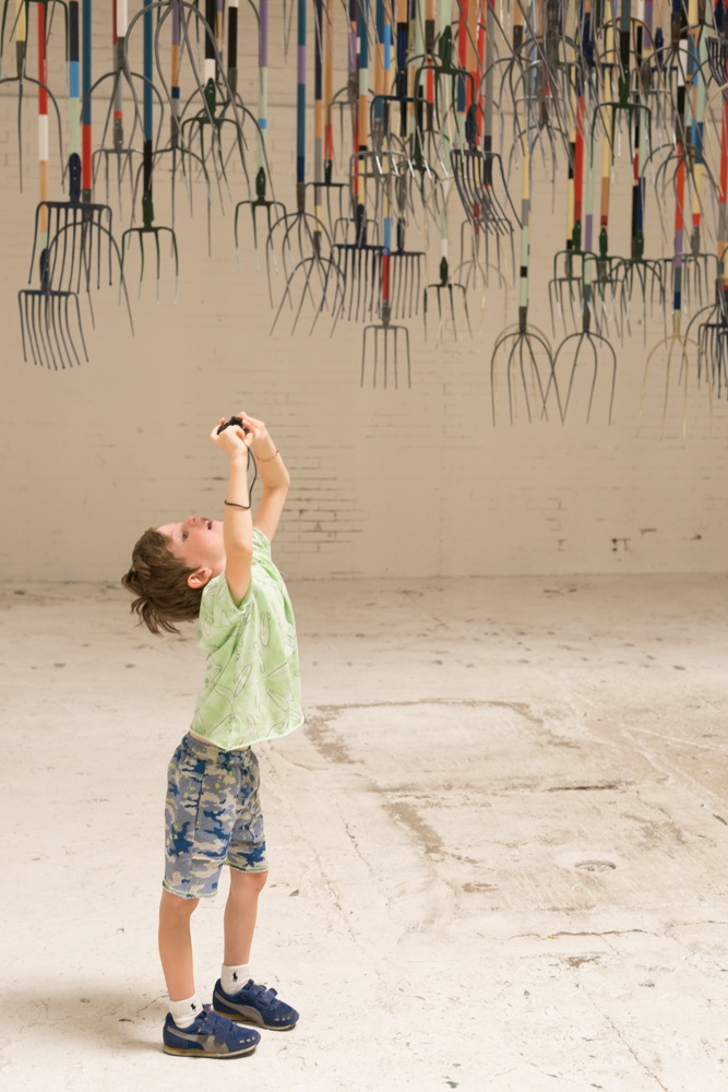
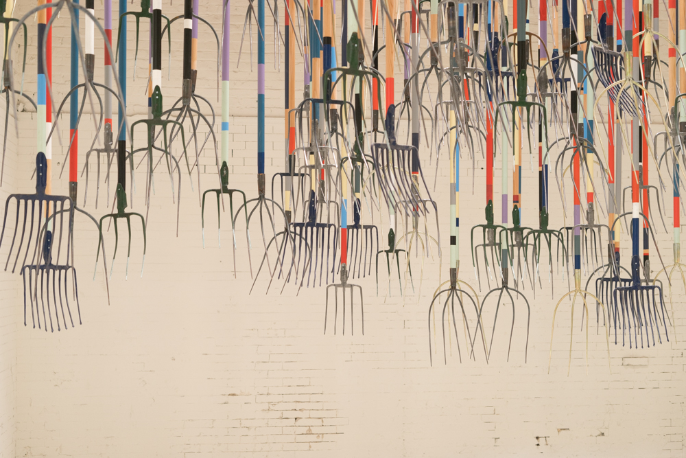
Upclose of The Crusher by Simon Birch, 300 wood and steel painted pitchforks suspended from the ceiling. Acrylic paintings by Dominique Fung, The Inhabitants. Closeups of vegetables in various stages of decay.

One way we've found to keep our son actively engaged while looking at artwork is to give him a camera to record his own view of the art. It's fascinating to see the angles and compositions he comes up with. We also discuss what's going on in the piece, be it the subject matter, technique employed, setting or materials involved.

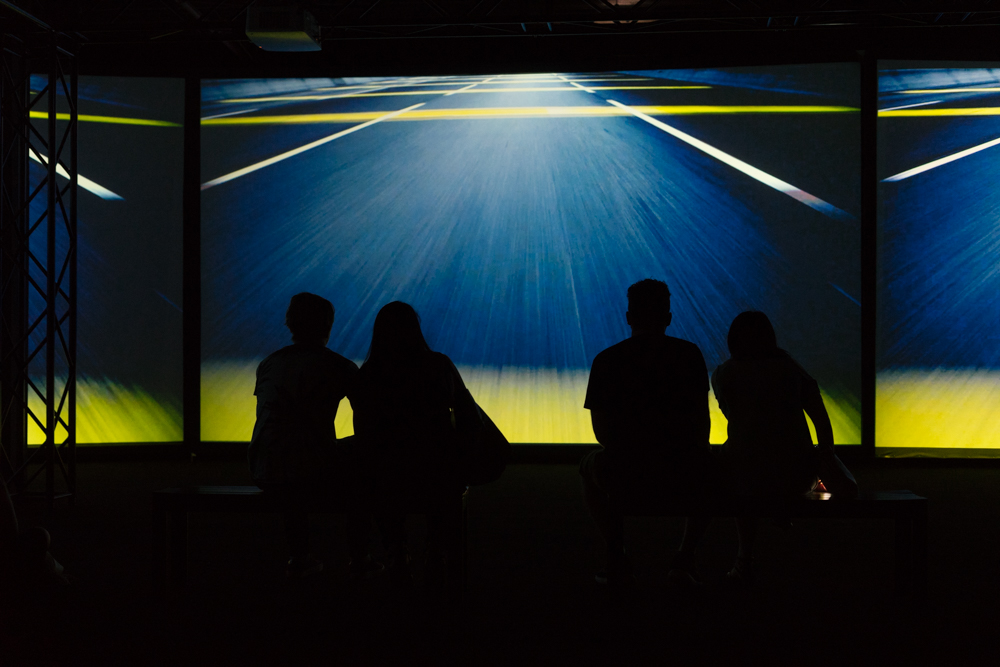
Closeup of the audience watching of The Inevitable By Eric Hu and Simon Birch.

Closeup of the audience watching of The Inevitable By Eric Hu and Simon Birch.

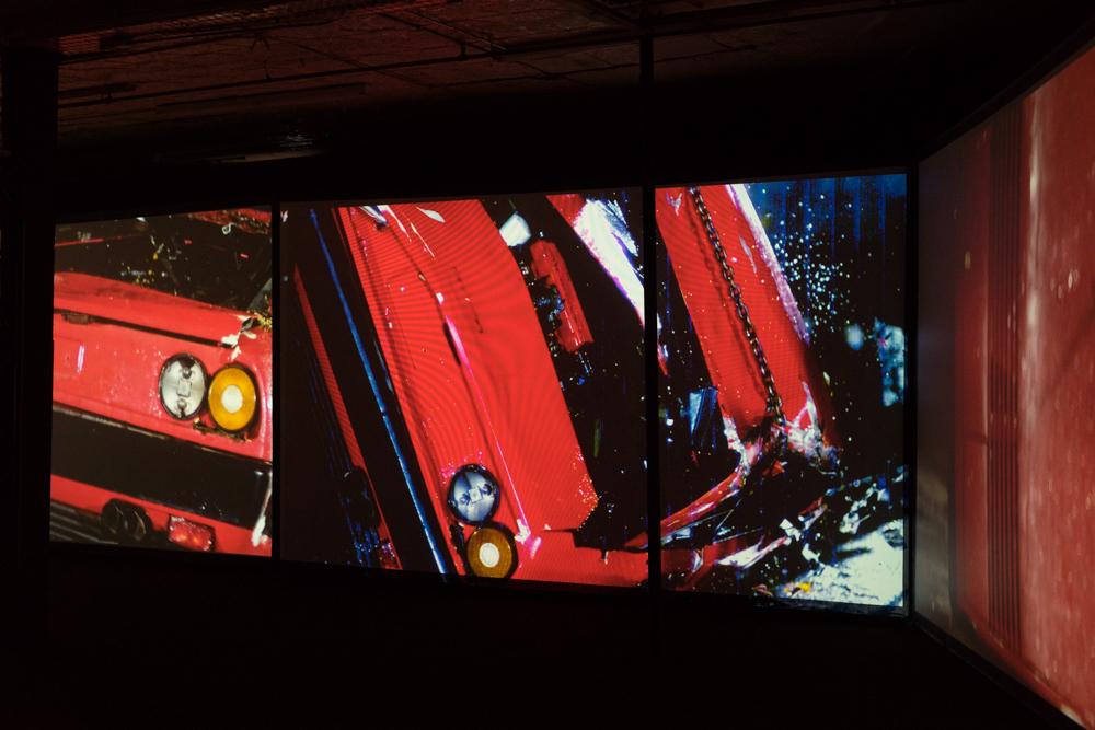
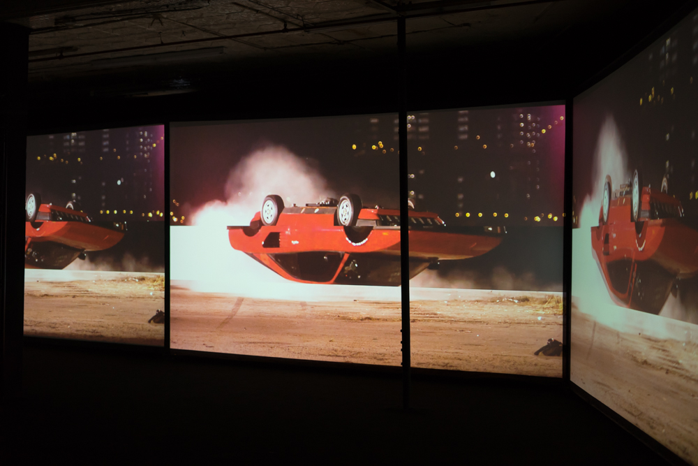
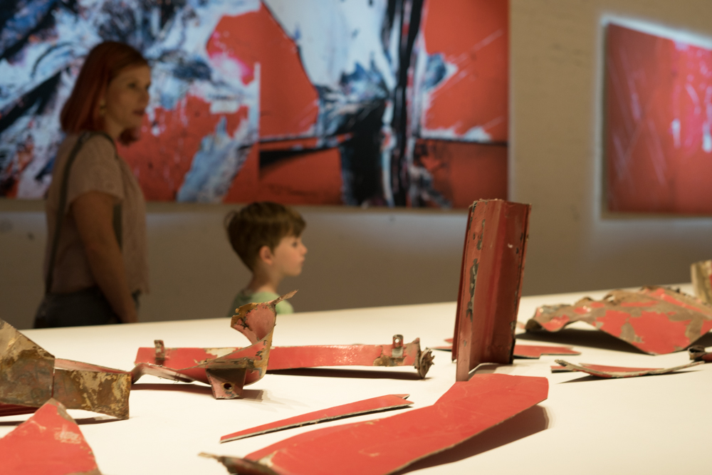
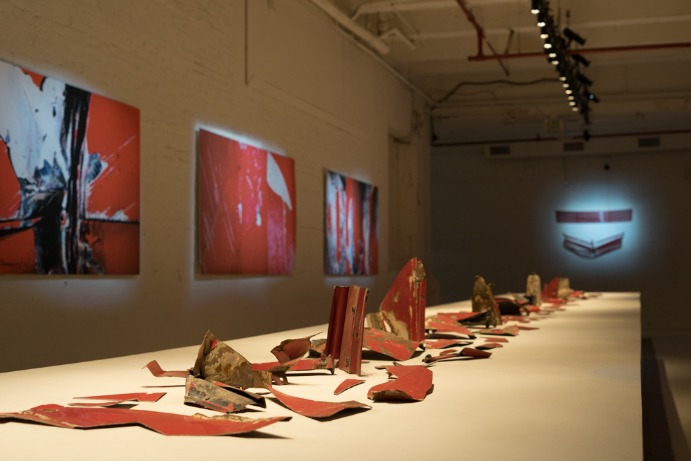
The video of a vintage Ferrari speeding and crashing, flipping over and over until it's destroyed feels hypnotic and voyeuristic, it's hard to look away from. I'm not personally a big car fan, but I can imagine that this video is upsetting for any car aficionado. My son was incredulous that anyone would willing destroy a car. (Again 5 year old here) Various pieces of the car wreckage are displayed on a long table in the adjoining room like archaeological finds.

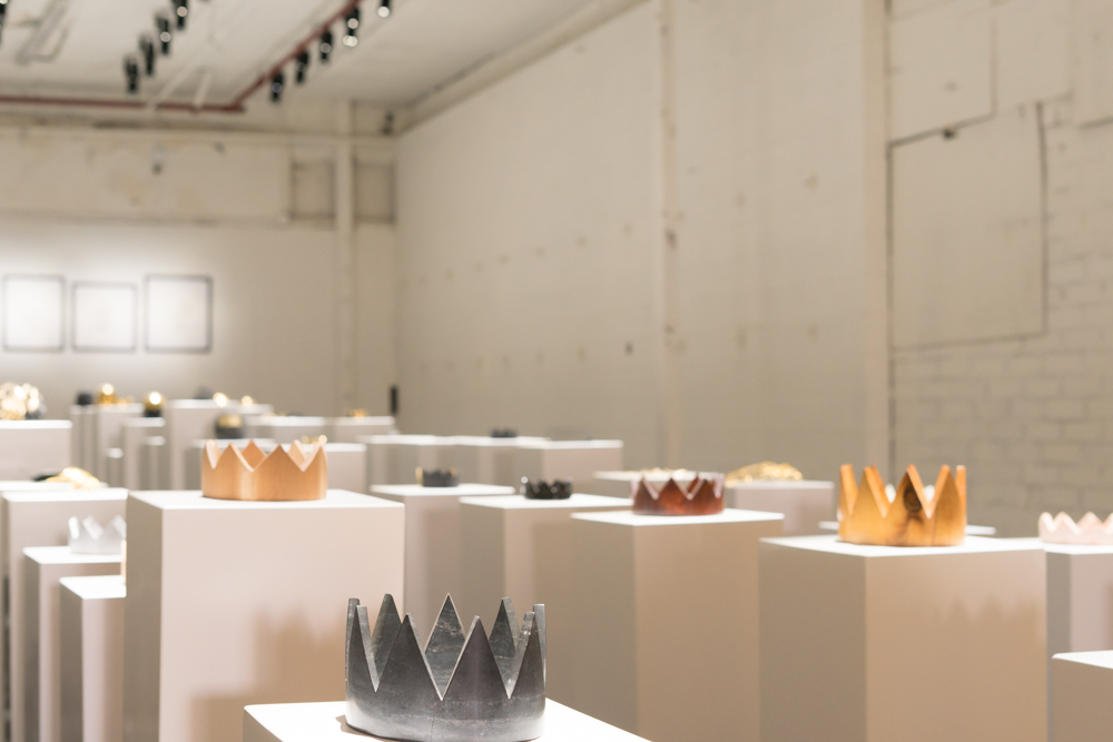
Hypercaine by Simon Birch, Gloria Yu, Gabriel Chan, and Jacob Blitzer.

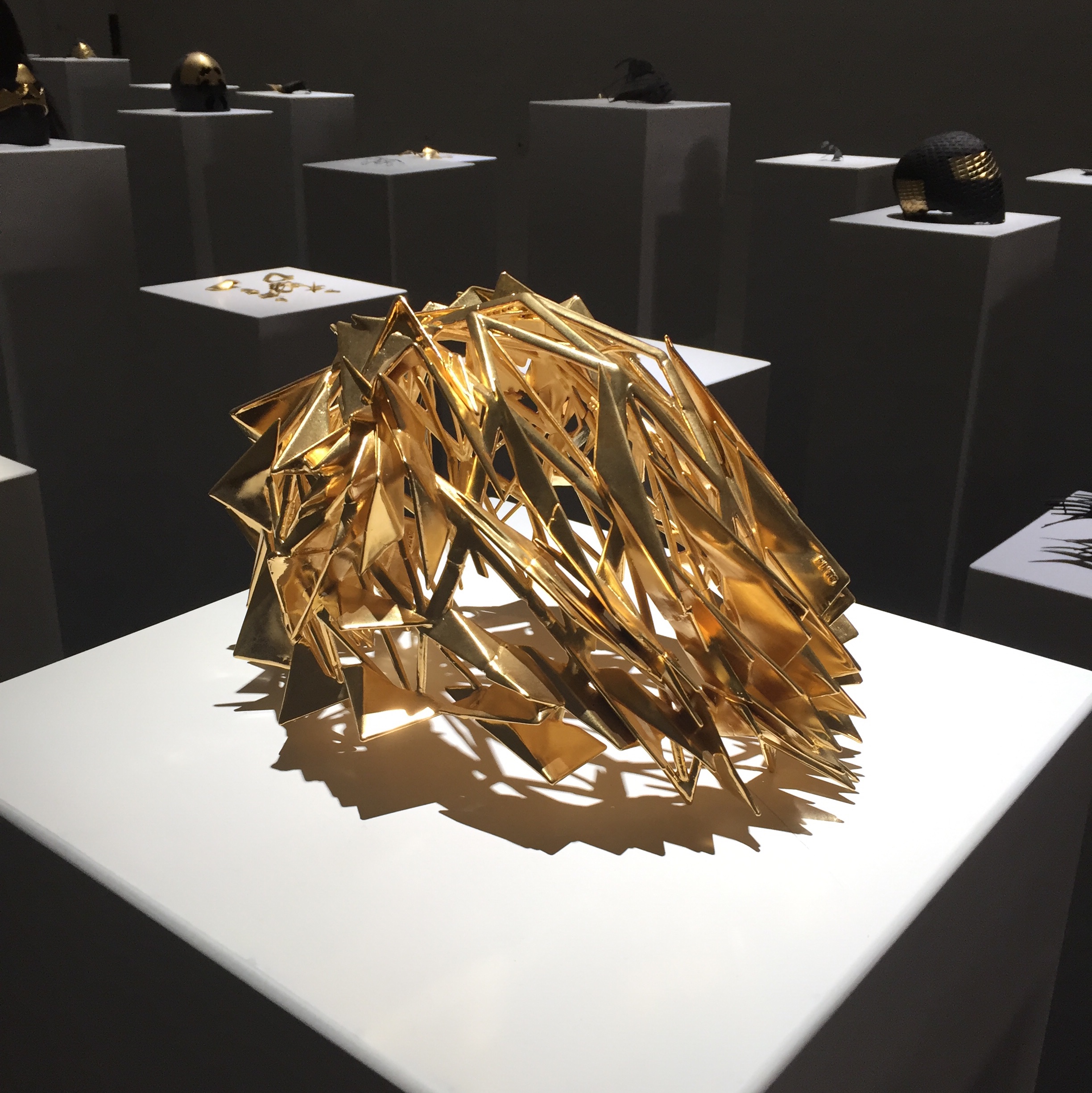
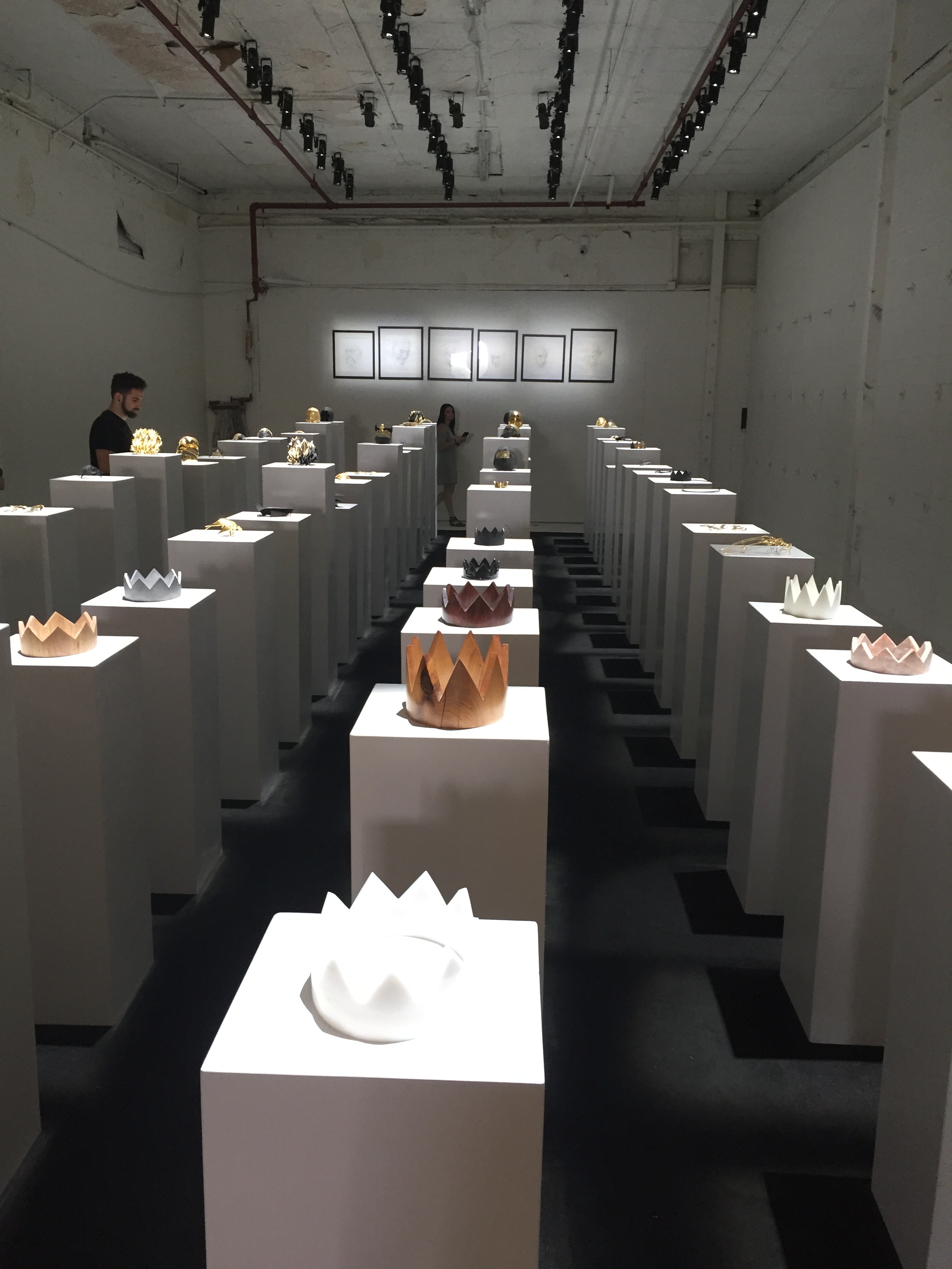
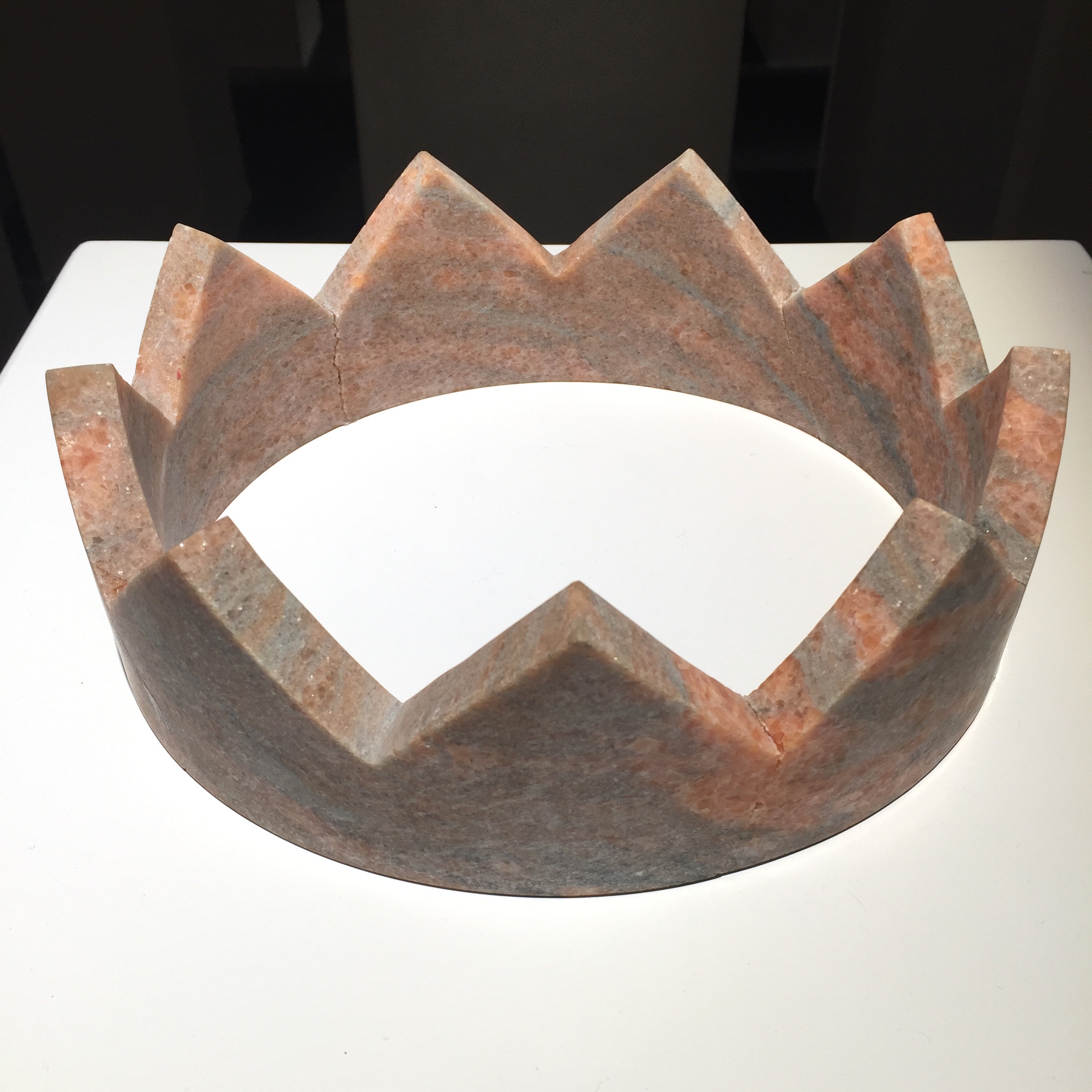
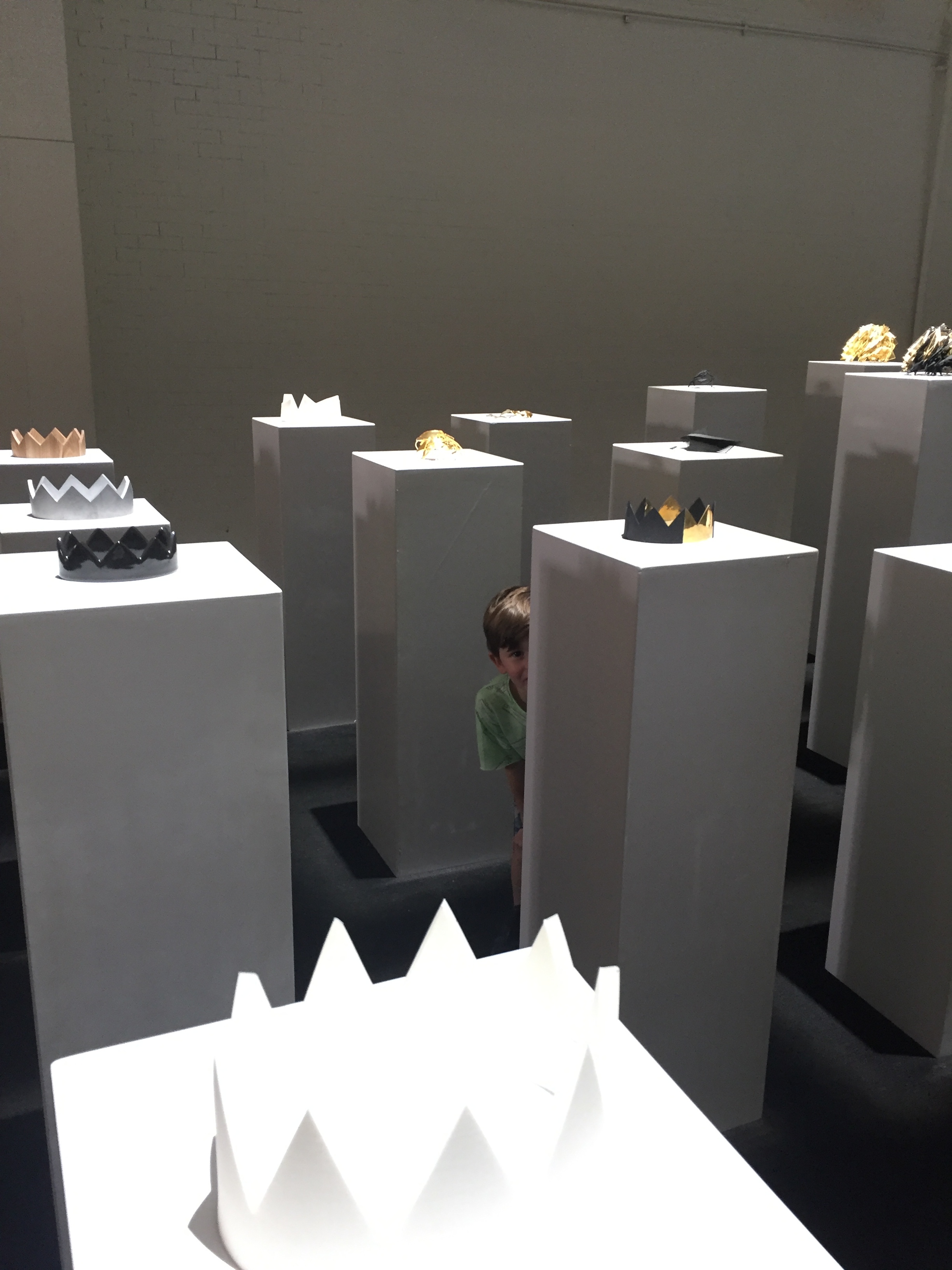
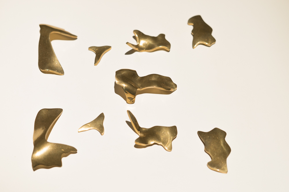
Sometimes you experience an emotional reaction just from simply looking at a piece of art, and with others the story behind it makes it much more impactful.  At first glance, this room had simplistic crowns made out of various stones and metal juxtaposed with more intricate Alexander Mc Queen like head pieces and some metal fragments. When chatting with the security guard, he explained that various pieces throughout the exhibit detailed the emotional journey that Birch embarked up on after being diagnosed with terminal brain cancer. Some pieces represent the chaos and turmoil of receiving such a grim prognosis. Others are more hopeful. The metal fragments and some of the metal cages were made from Birch's actual brain scans. This is also the room where a girl attempting to take a selfie recently fell backwards, knocking several of the pedestals down in a domino effect and causing $200,000 worth of damage. Its great when people can get right up close to enjoy and experience the artwork but it's a shame when people are careless and inconsiderate. Just because it's not a conventional museum viewing experience doesn't mean that the artwork shouldn't be treated with the same respect.

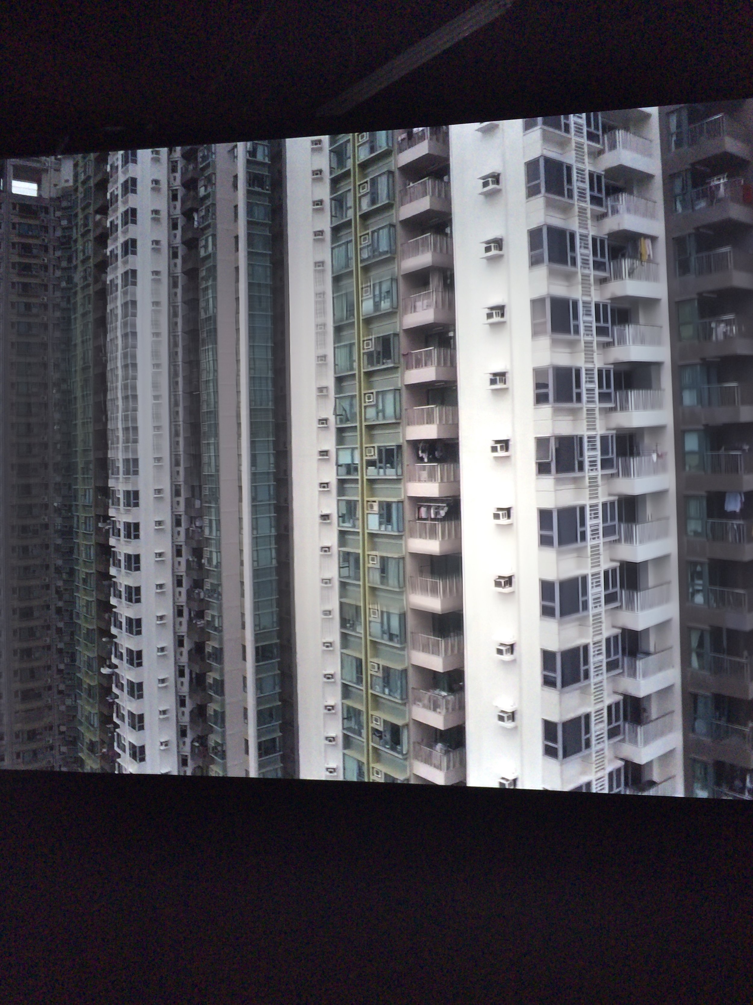
Tannhauser by Simon Birch

Tannhauser by Simon Birch

One of my strongest memories living in Hong Kong was how crowded it was, with people and buildings.  It made New York City look like a suburb. I was there in 1997 so I can only imagine what its like now, with the rapid pace of development. Hong Kong has so many of these drab high rise buildings shooting everywhere out of the ground up to the sky everywhere as far as the eye could see.  Tannhauser gives the experience of riding upwards in a glass elevator outside these buildings as it goes from the ground floor up. Dizzying and electrifying, I really enjoyed it and you can see from the face of my son above, he did too!
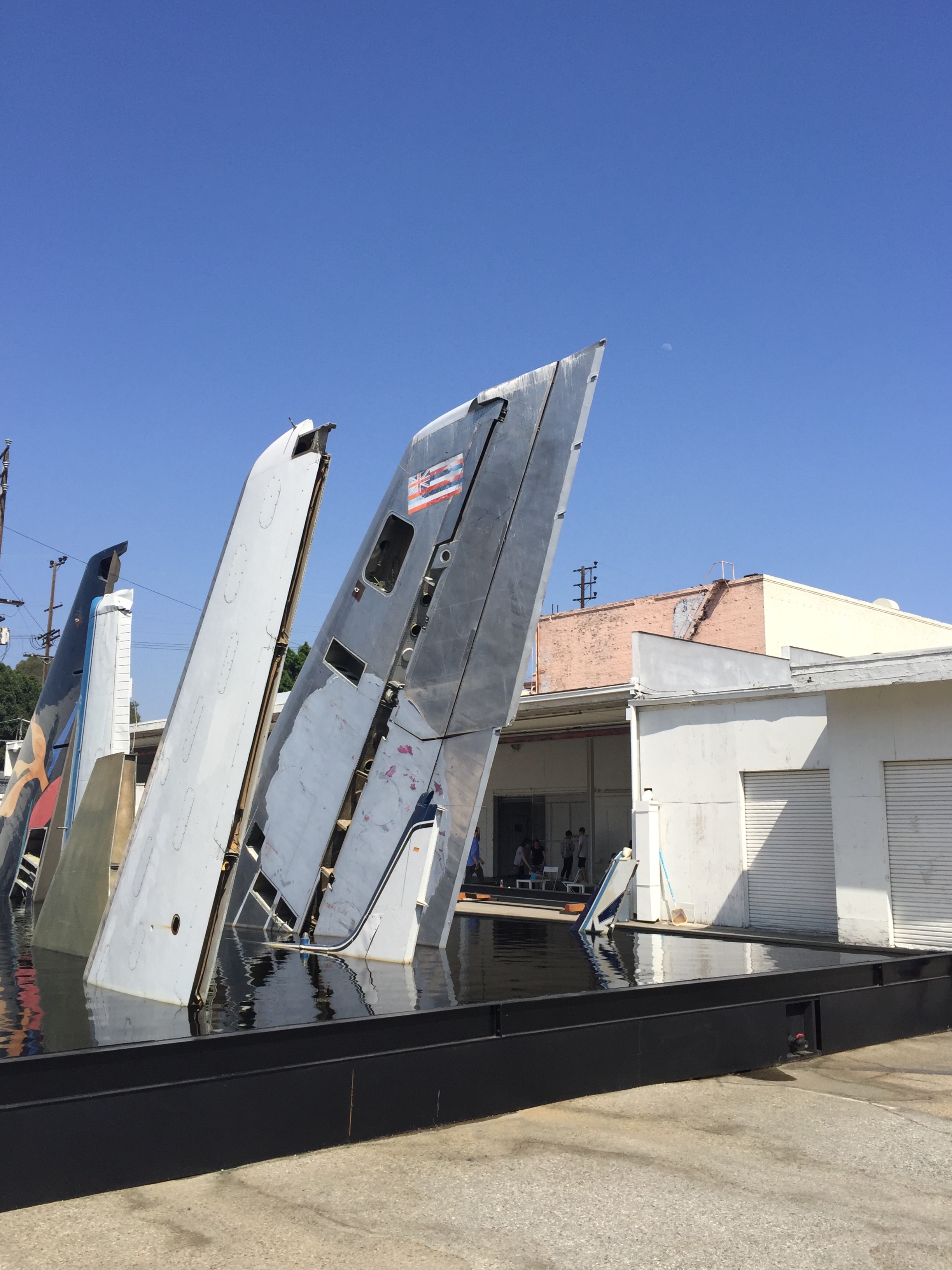
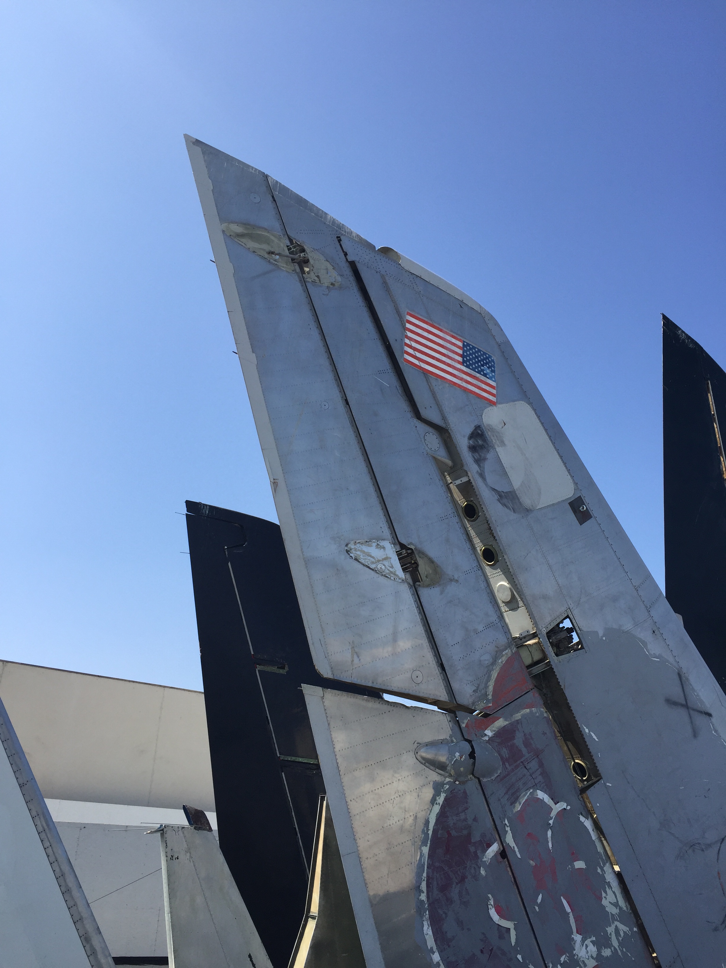
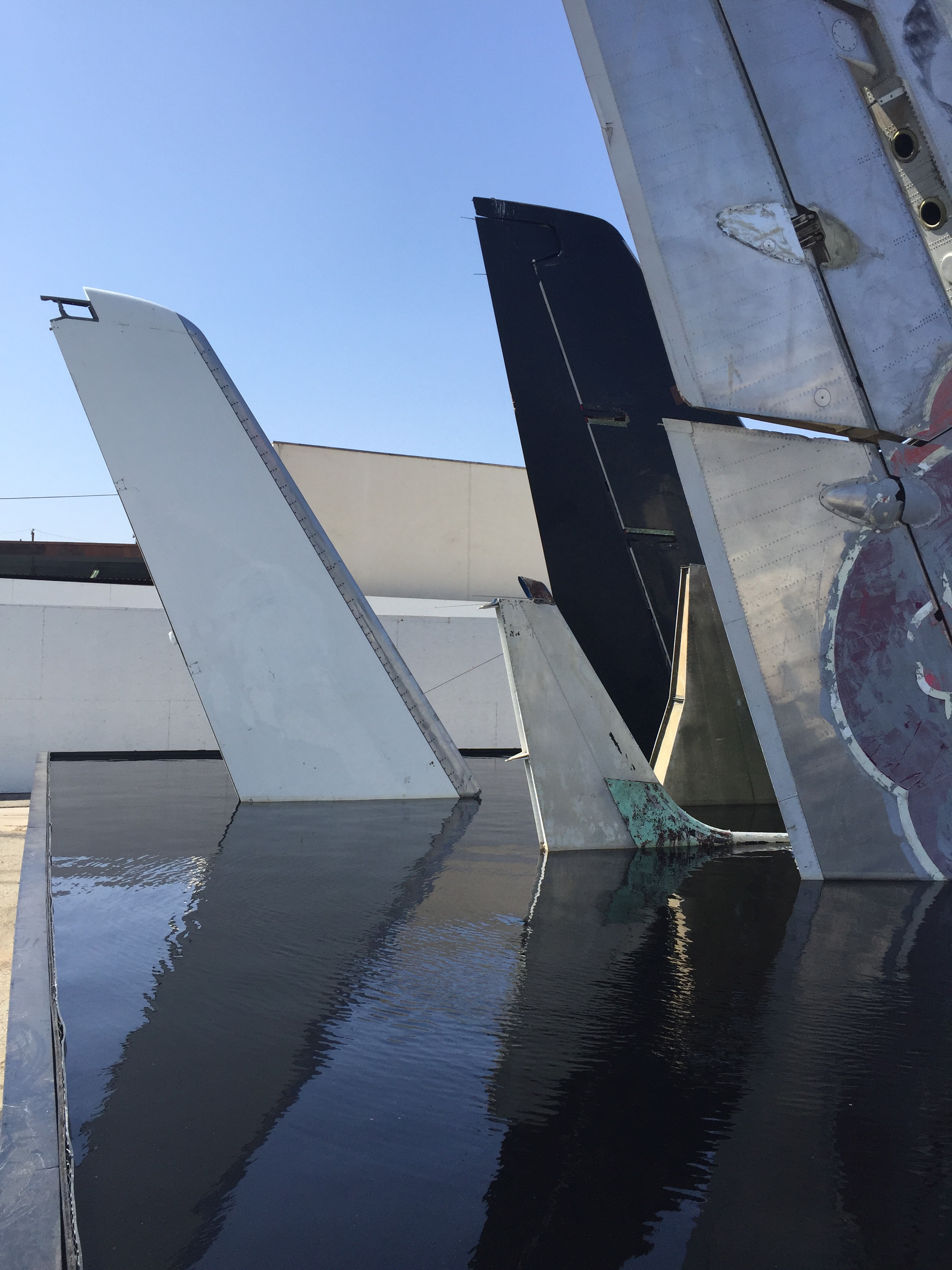
Clear Air Turbulence by Simon Birch

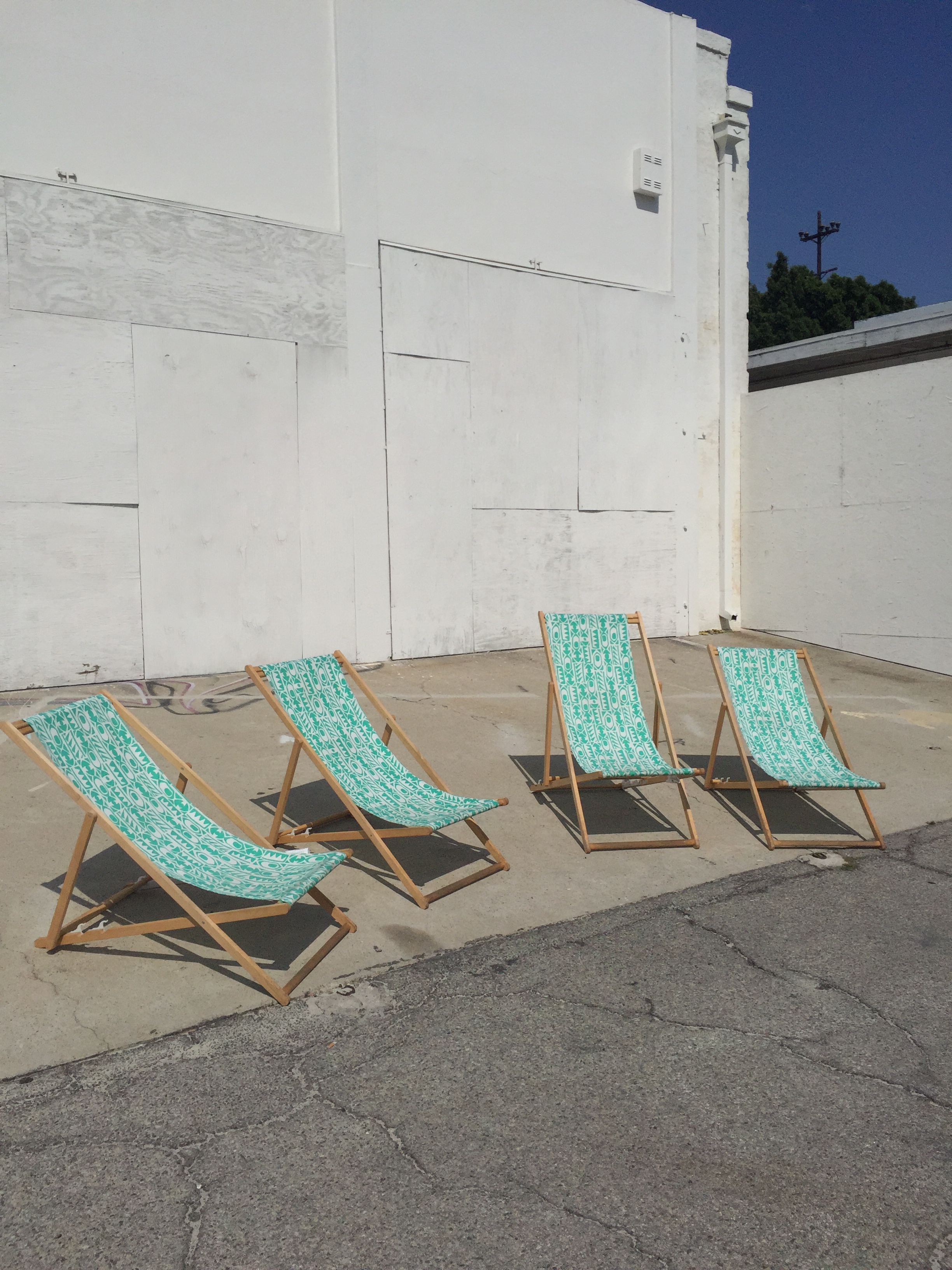
The last piece of the show is Clear Air Turbulence, which is comprised of salvaged airplane tails submerged in a steel frame pool.  The shadows reflecting in the still water create a peaceful calm while the eeriness of the subject matter makes it slightly unsettling. The airplane tails seem like a scene of a giant plane crash. With the deck chairs circling one end its like pulling up a chair to a car crash. Voyeurism on steroids.

14th Factory closes July 30 with special events until then. A panel on the Art Experience and the age of Social Media is this Saturday, July 22 and Simon Birch will be tattooing various limited edition designs all day Saturday as well.

Tickets are $18 online, $22 at the door with residents of Lincoln Heights entering for free with valid license.

440 North Ave. 19
Los Angeles, CA 90031

Art, Fashion, Los Angeles CA

FIDM Museum Visit

Mood boards for some of the shows featured like Wallander, Man in the HIgh Castle and Mercy Street.

Mood boards for some of the shows featured like Wallander, Man in the HIgh Castle and Mercy Street.

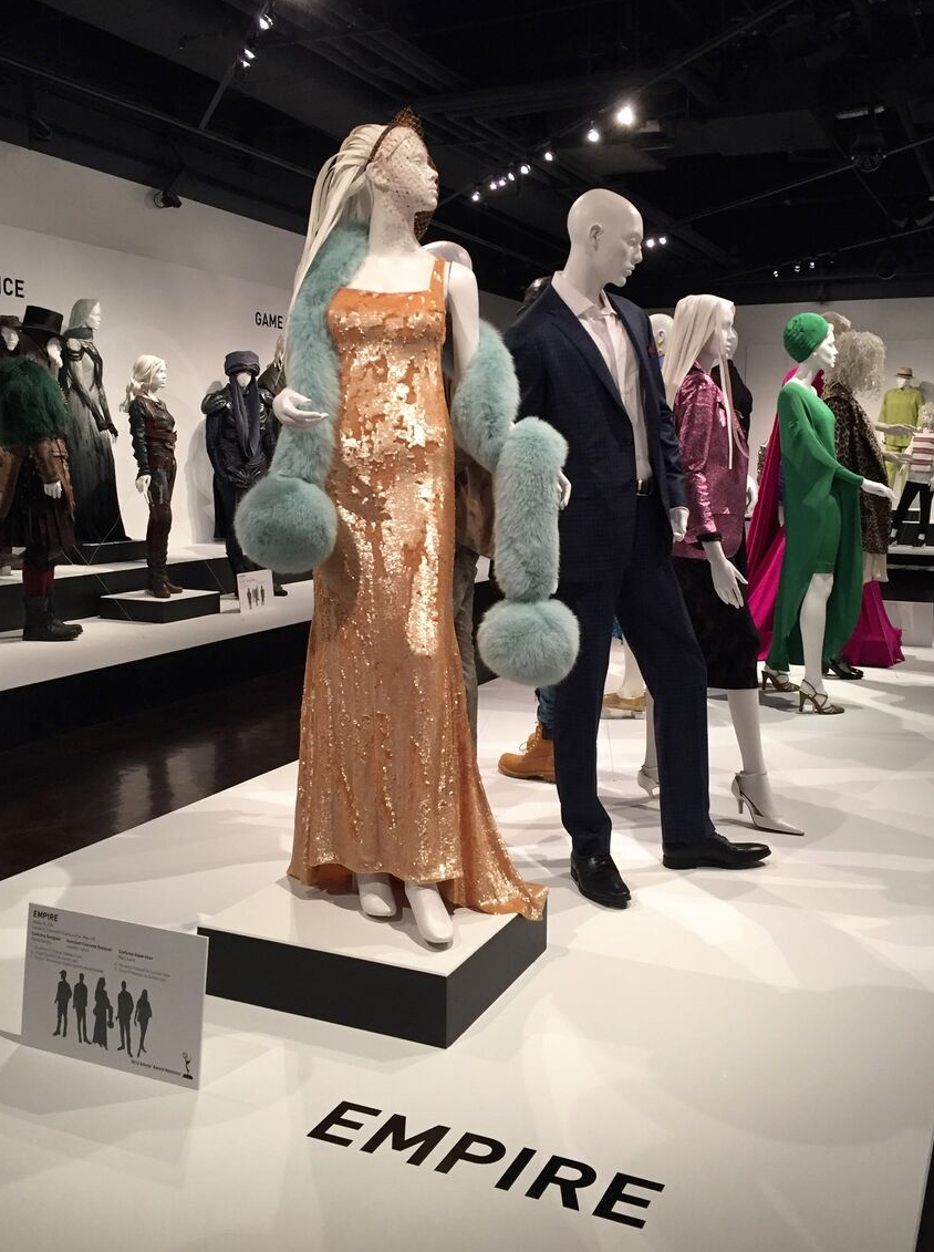
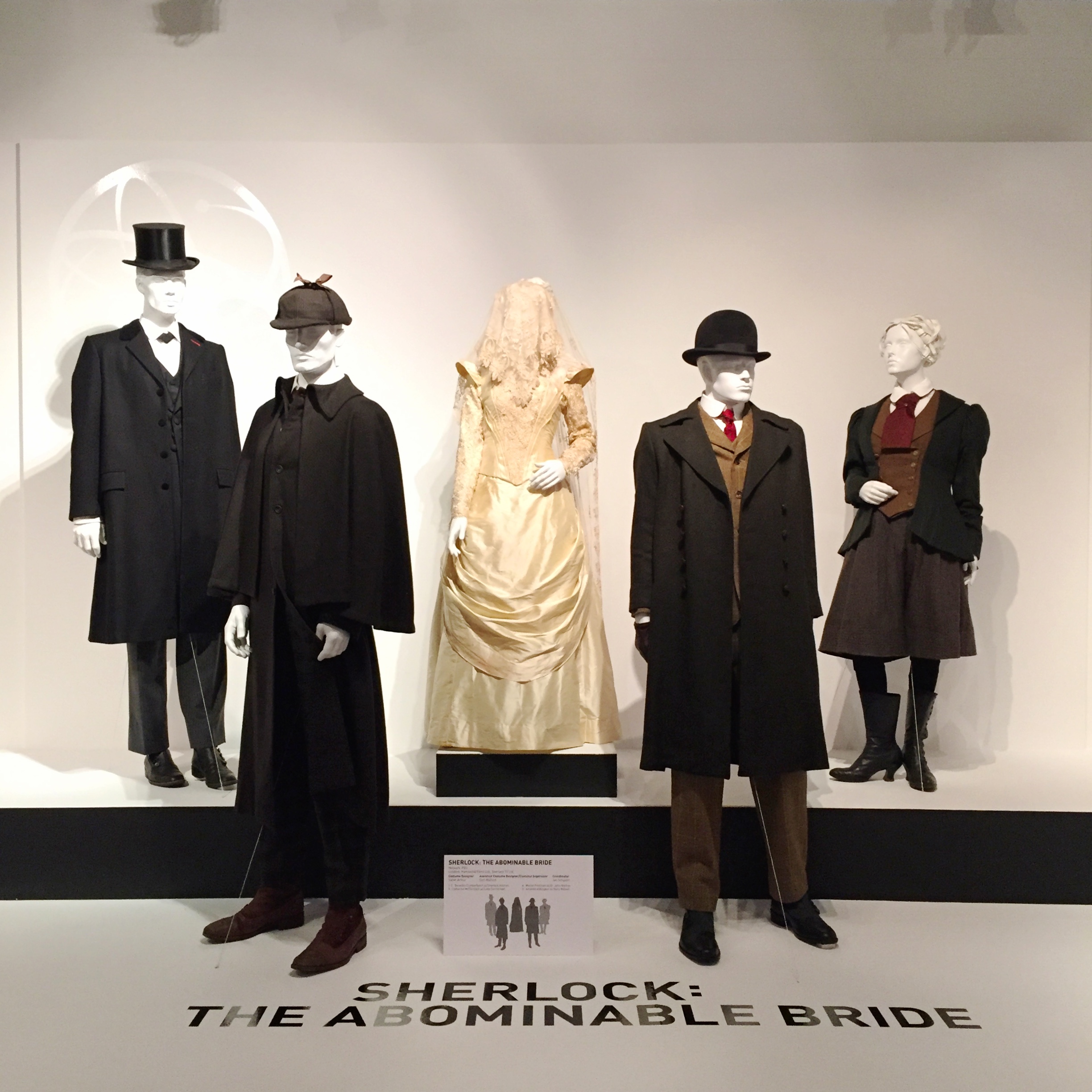
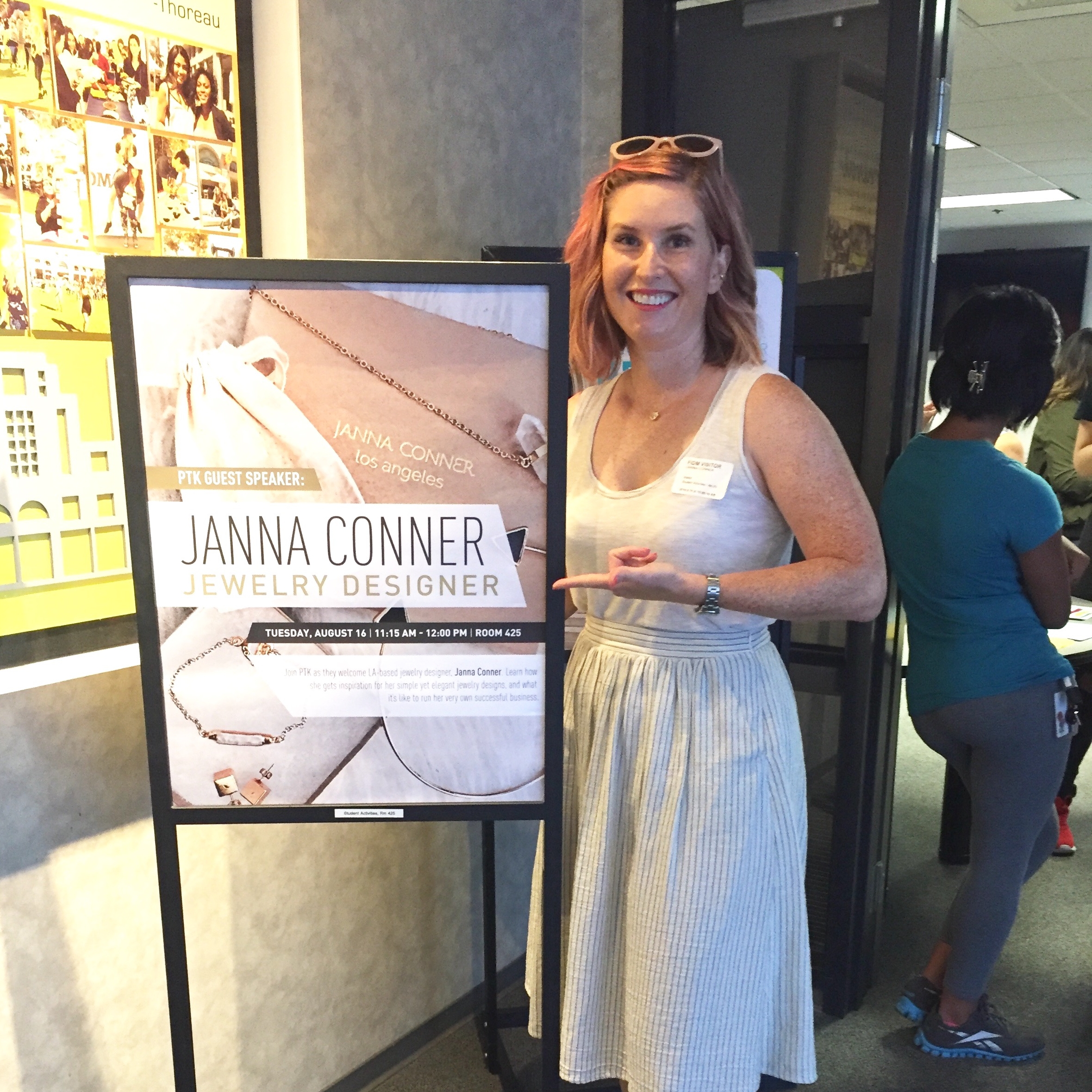
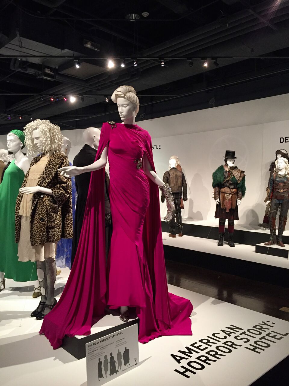
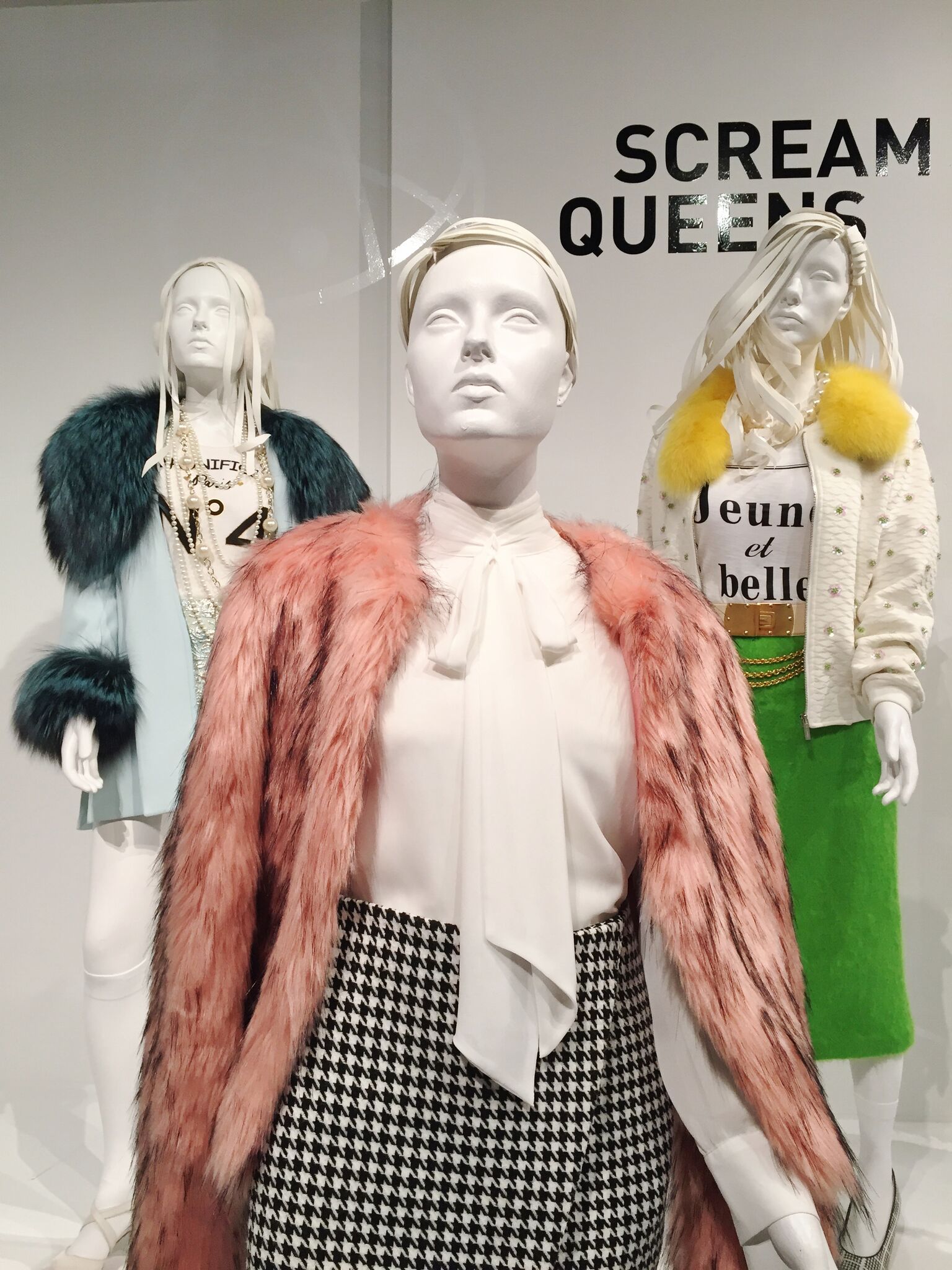
I recently had the pleasure of visiting the LA campus of Fashion Institute Design and Merchandising (FIDM for short) to talk to their Honor society, Phi Theta Kappa. We chatted about the pleasures and pitfalls of owning your own business, the importance of social media, trend forecasting and networking with other like minded entrepreneurs. I love meeting young people, interacting with them helps me to stay current with today's trends and tomorrow's customers. After my talk,  I checked out the TV costume design exhibit next door at the FIDM Museum, which to my delight had costumes from many of the shows that I love to watch. Costumes range from period to contemporary and include Wallander, Downtown Abbey, Roots, Sherlock Holmes, Mercy Street, The Man in the High Castle, Game of Thrones, Empire, Veep, American Horror Story, Transparent, Jane the Virgin, My Crazy Ex-Girlfriend, and Scream Queens. This exhibit is free to the public and open Tuesday-Saturday 10 am -5 pm until October 15.

Love Downtown Abbey, so of course I made a beeline for these dresses, immediately upon entering the exhibit. Love the signature twenties era stying of the drop waists for Lady Rose on the front rightand flapper sequin beading and long necklace for Lady Mary in the back. I remember her wearing this dress!

Winter is coming! I look forward to watching G.O.T. every season for the amazing sets and locations. It was fun to get a chance to witness the elaborate beading, incredible attention to detail and substantial costumes up close in person. 

I was late to the game on Veep but once I checked it out, it quickly became one of my favorites. Julia Louis-Dreyfus is a comic genius and the rest of the cast is equally talented. I like that it's similar to House of Cards in that you feel like you are getting an accurate portrayal of what life in politics entails but it does it with humor instead of shock value. There are so many heavy dramas out there right now that it's refreshing to watch a light one without all the angst and turmoil.

I'm a bit of a scaredy cat so I will admit that I don't personally watch American Horror Story but my husband does so I will see snippets here and there. I love that the most recent season was filmed at Cicada in downtown Los Angeles, in the historic 1928 Oviatt building which I walk by every time I'm running errands in dtla. My best friend got married there so every time I would see episodes of AMHS, it would bring back happy memories. In my opinion, the costumes, and locations are the best part of AMHS. I love the dark moody vibe of the show, and in particular Lady Gaga's wardrobe. Divine!

Love the color of this pink faux fur jacket, it would go great with my rose gold hair! Haven't seen either Scream Queens or Empire but liked what I saw costume-wise!

Love me some Benedict Cumberbatch, and love even more that his fans are called Cumberbitches. (I will neither confirm nor deny that I might be one). I wish Benedict would give the movies a rest (I did like Imitation Game though) and return to filming this great show.

Talking at FIDM

Talking at FIDM

That's me!

That's me!

Travel, Art

The Broad

The Broad Museum - Downtown Los Angeles

The Broad Museum - Downtown Los Angeles

Detail of the honeycomb lattice exterior.

Detail of the honeycomb lattice exterior.

The newest addition to the burgeoning LA art scene is the Broad Museum. It truly is an impressive site to behold! I love passing by it and Disney Hall every day on my commute. It's such a welcome addition to the neighborhood. It's across from MOCA, now making it a mini museum row of two impressive collections. The Broad was designed by Diller Scofidio + Renfro in collaboration with Gensler, it's a 120,000 square feet example of the "veil and vault' concept. Home to almost 2,000 works of art, there are two stories of gallery space combining public exhibition space with collection storage. The vault which houses the art storage defines the user experience throughout the museum.  It's heavy mass is visible from underneath on the ground floor and on the top level when you are walking on it.

Arriving at The Broad, going up the elevator through the vault to the top level..

Arriving at The Broad, going up the elevator through the vault to the top level..

 John Baldessari - Tips for Artists Who Want To Sell, 1966-68Getting tips to make some money! 

 John Baldessari - Tips for Artists Who Want To Sell, 1966-68

Getting tips to make some money!


Jeff Koons - Tulips, 1999-2004. Background: Christopher Wool - Untitled, 1990

Jeff Koons - Tulips, 1999-2004. Background: Christopher Wool - Untitled, 1990

I never thought I was that much of a Jeff Koons fan but there are several works of his on display at the Broad. He's apparently one of their favorite artists to collect. The way the Tulips are displayed is pretty incredible. Light floods in from every angle from the honeycomb "veil" which forms the ceiling. On a sunny day, (of which there are no shortage of in LA) it's breathtaking. With all the light, the colors are brighter, and the reflections of the metal really standout.  There is another Koons Tulips, at the Wynn hotel in Las Vegas. See here what a difference light can make! Behind the Tulips, is a work by Christoper Wool, an artist I wasn't that familiar with but have since come to enjoy. i love how the two works of art complement each other in the space.

Julie Mehretu - Cairo,2013

Julie Mehretu - Cairo,2013

Just on the side of the Tulips is another giant piece by Julie Mehretu.  Her painting juxtaposes precise technical architectural drawing with the chaos of a windstorm blowing through the city of Cairo. It's a subtle yet impactful piece. I love the little pops of neon color peppered throughout the delicate drawings.  Mehretu, born in Ethiopia,  is one of the many female and various ethnicities represented throughout the Broad. I appreciate the cultural diversity of its collection. Touring through the space I felt that they tried and succeeded in the effort to represent male and female artists from all over the world. Sure, there are the usual who's who of contemporary art like Koons, Hirst, Burden but there is also Kara Walker, Yayoi Kusama, Glenn Ligon, and Barbara Kruger to name a few.

The Vault

The Vault

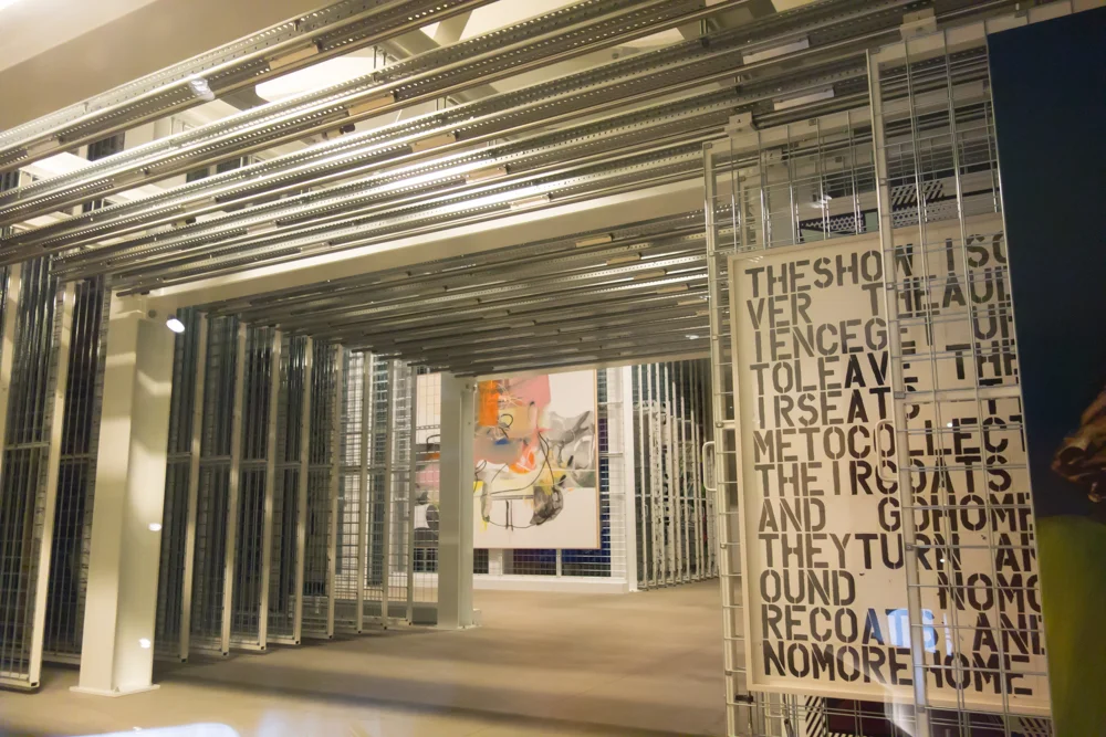
If you take the elevator down from the top level, you will miss one of the most interesting parts of the Broad. The vault, where they store all of the art that is either not in use or on loan, can be seen from the small stairway that leads down to the ground floor.  The Broad Art Foundation purchases fifty works of art annually, that's almost one a week! With all that art, not all can be on display at once so they have to rotate. This is the case in most museums just you never get to see behind the curtain into how or where they store all the unused artwork. The viewing windows are a clever addition to the building, offering this permanent behind the scenes view.

Yayoi Kusama - Infinity Mirrored Room - The Souls of Millions of Light Years Away, 2013

Yayoi Kusama - Infinity Mirrored Room - The Souls of Millions of Light Years Away, 2013

A trip to the Broad would not be complete without a visit to the Infinity Mirrored Room. The wait can run hours long for the room, an experience that only lasts approximately three minutes. My recommendation is to sign up on the queue immediately upon entering the museum. The day I went the wait was two hours but I went and toured the museum and had lunch and by the time I was done, I received my text to line up. At that point, I only had to wait 10 minutes in line. Once allowed in, the room is quite small with a central bridge that juts out over water. There are hanging lights everywhere and they are reflected on the mirrors surrounding you. Unlike with LACMA's Rain Room (which is awesome by the way) you get to enter with only your party so you can take photos with abandon and not have random people in your shot. Something I wished they did a better job of at the Rain Room but that's another story...

Ragnar Kjartansson - The Visitors 2012

Ragnar Kjartansson - The Visitors 2012

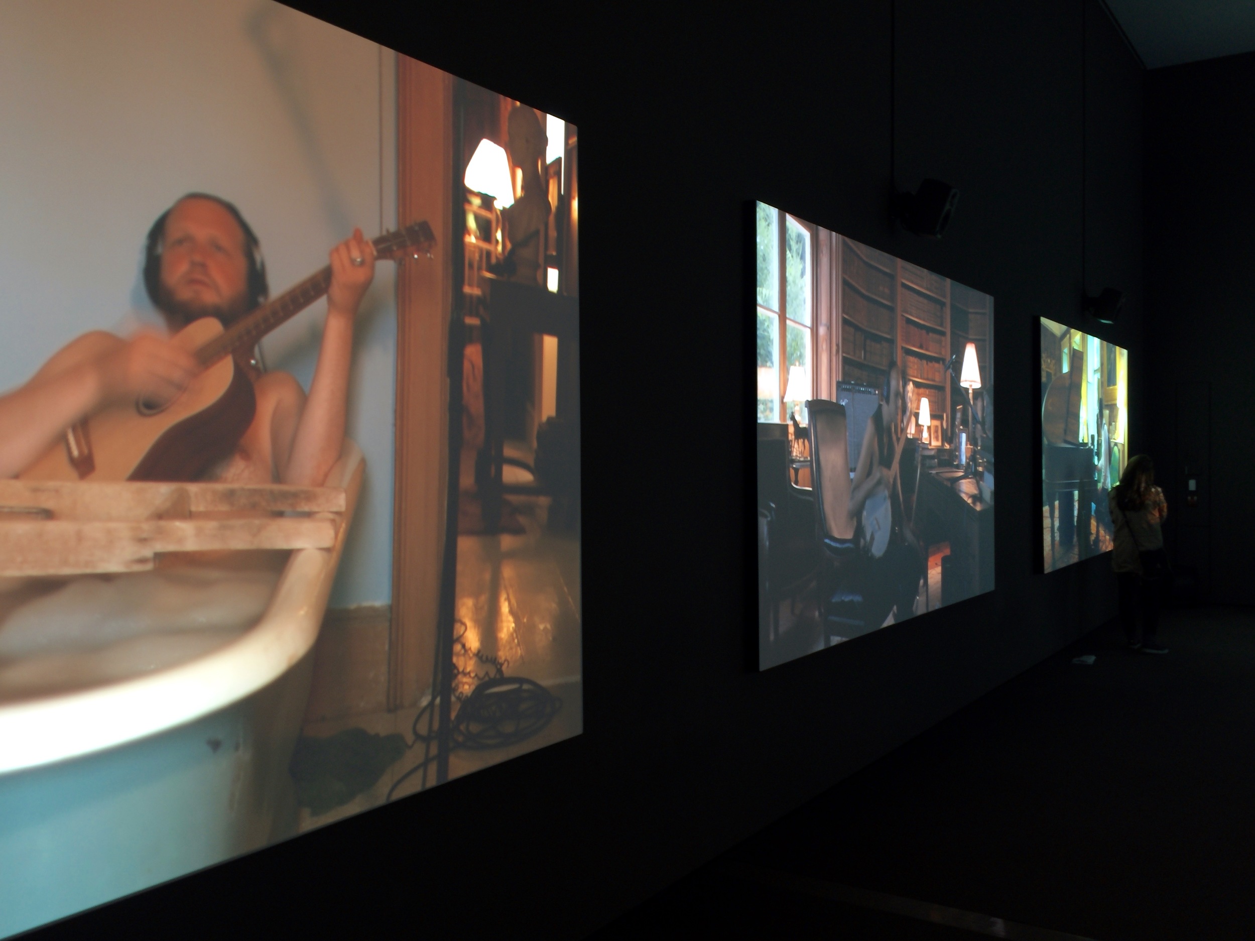
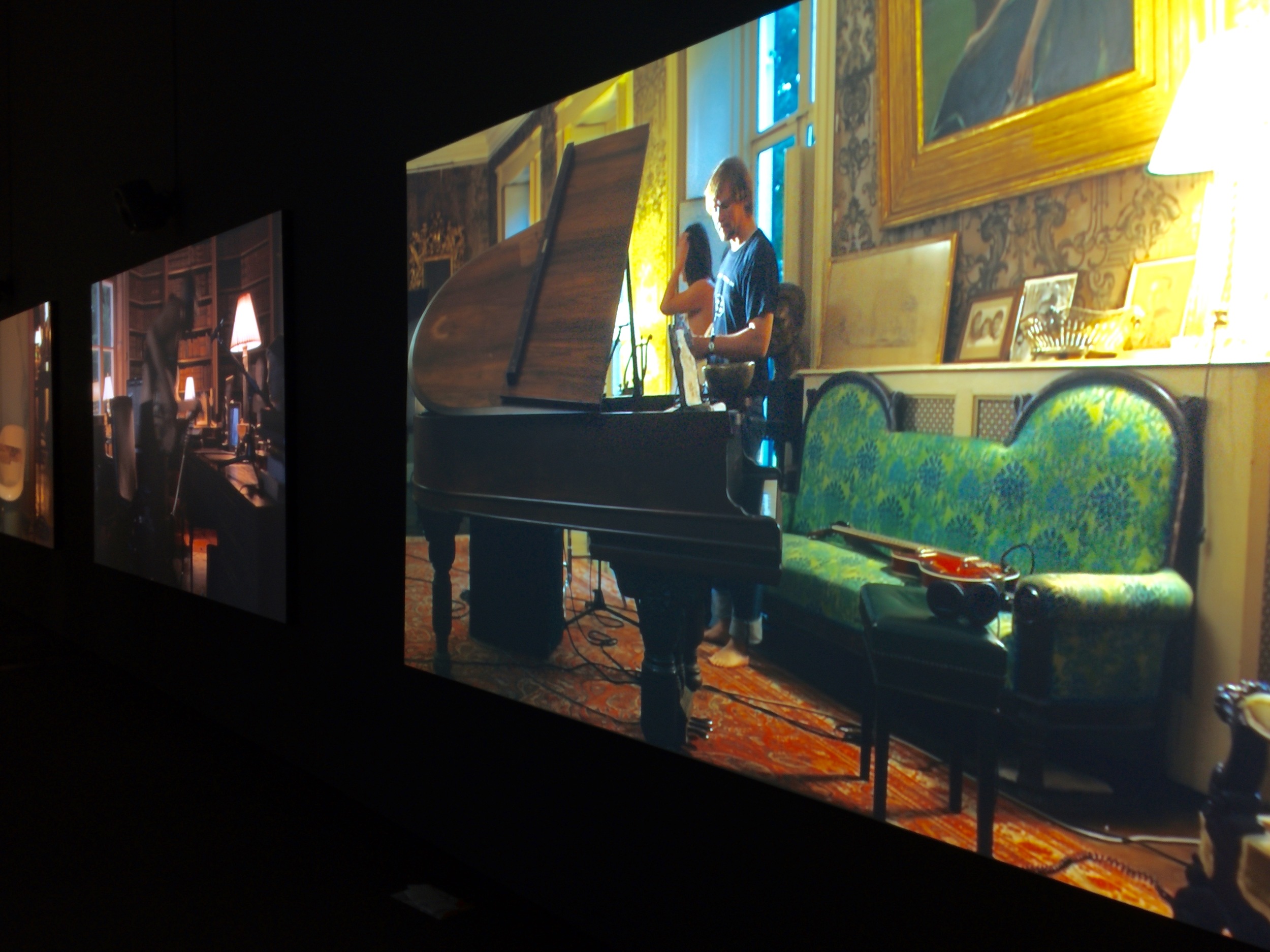
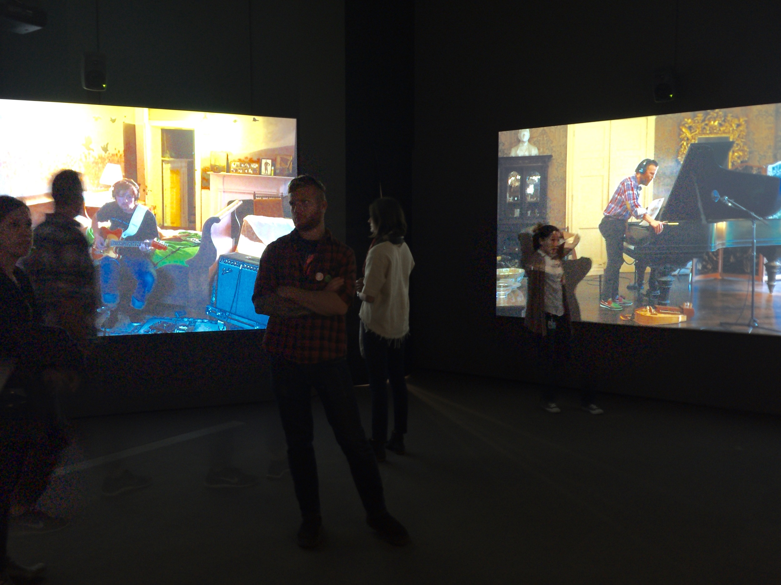
One of my very favorite pieces at the Broad is The Visitors by Icelandic artist Ragnar Kjartansson. It's an hour long video shot featuring nine musicians playing the same song in several rooms of a decrepit house in upstate New York. The viewer is omnipresent, being able to view the musicians walk from one room to the next, and engage with each other or remain solitary in their chosen room. Kjartansson himself plays the guitar in a bathtub throughout the piece. The musicians are playing the same piece of music over and over for the entire hour. What seems like would become maddeningly repetitive, is actually quite beautiful.  The Visitors explores how the same lyrics performed by different musicians transform from poignant to transcendent. I've seen this piece on several visits to the museum, and since it is an hour long, it's understandable that it can be challenging to see the entire piece from start to finish.  I've noticed that for people to really get it, it's helpful to see it from the beginning to see them setup in each room, interact with each other and then check back in at the end when they unplug and all leave the house together. Hurry and go see this piece before it and other pieces from the inaugural collection are taken down Sunday, May 1.  In order to prepare for a special exhibit with Cindy Sherman, opening June 12, The Visitors and other pieces on the ground floor innaugural collection will be taken down.  Hurry up and go already!

The bar. Interior shot by Otium.

The bar. Interior shot by Otium.

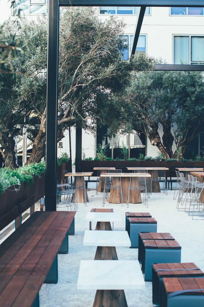
You might be hungry after seeing all those amazing works of art. You're in luck, because Otium, the new restaurant from French Laundry alum Timothy Hollingsworth and restaurateur Bill Chait ( of Bestia, Petty Cash, République and Sotto) is now open.  Hollingsworth, only 36, is a James Beard Rising Star Chef of the year recipient. A recent downtown Angeleno transplant, he describes his cuisine at Otium as "sophisticated rusticity with approachable elegance".  Otium makes the most of local talent with the vertical gardens that it cooks with by LA Urban Farms, furniture by LA furniture designer Chris Earl, staff aprons by Hedley & Bennett,  outdoor design by South Pasadena's House of Honey, and ceramics by Heath and Irving Place Studio.

Stefan Sagmeister - Inside Out and Outside in. photo by Cassia C. Borges.

Stefan Sagmeister - Inside Out and Outside in. photo by Cassia C. Borges.

I love this hand painted wall of thicket of branches spelling "Inside Out and Outside In" by Stefan Sagmeister. He's an Austrian born, New York based graphic designer and typographer, renowned for album covers for Lou Reed, David Byrne and the Rolling Stones.

Courtyard by House of Honey

Courtyard by House of Honey

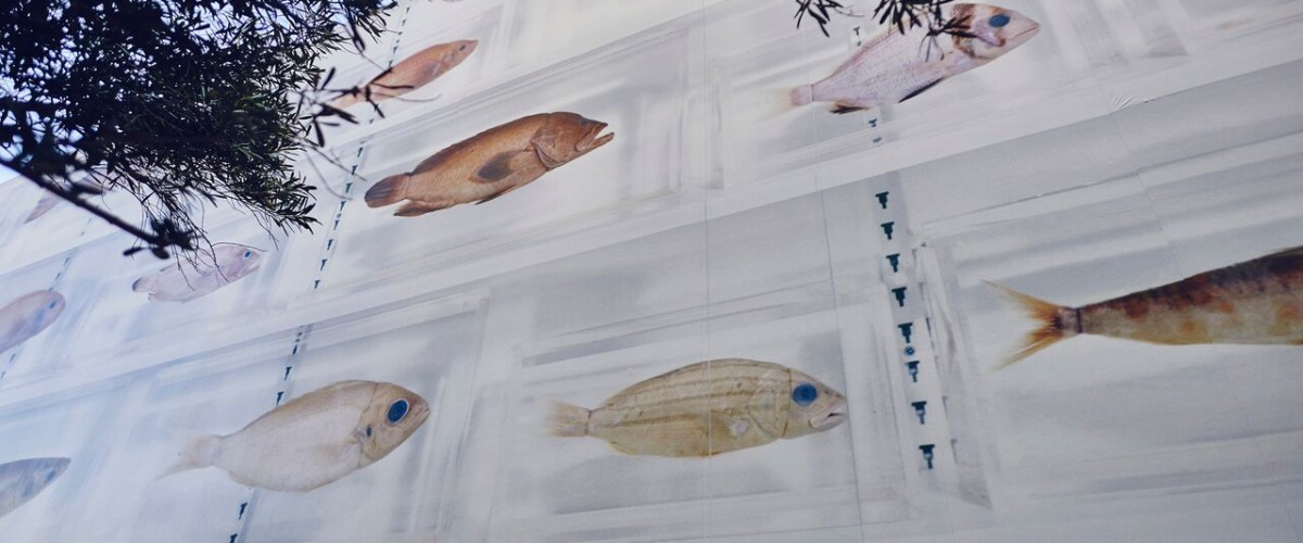
Damien Hirst Isolated Elements. Large scale photographic mural on the exterior wall of Otium.

Damien Hirst Isolated Elements. Large scale photographic mural on the exterior wall of Otium.